
You don’t need a sledgehammer and a demo crew to make your living room feel larger. With the right furniture placement and a few clever visual tricks, you can fake square footage like a pro. Ready for layouts that stretch your space without stretching your budget? Let’s play Tetris with your furniture.
1. Float Your Furniture (Yes, Seriously)
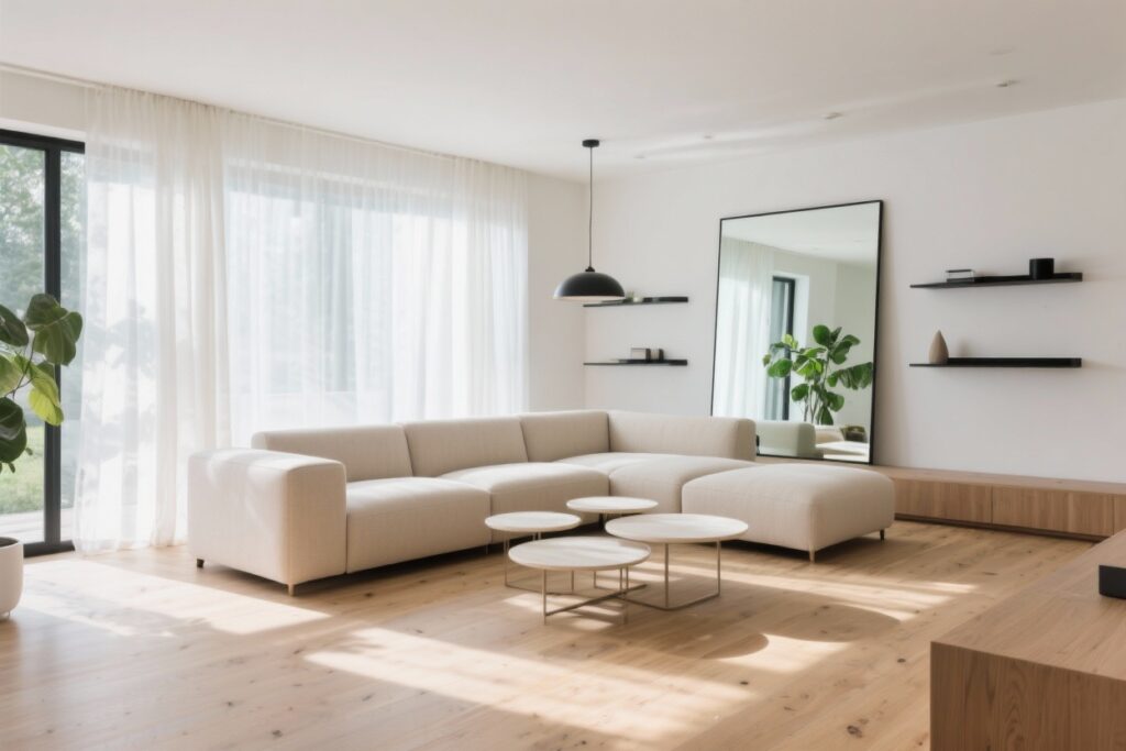
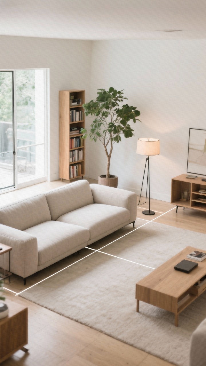
Pushing everything against the walls might feel logical, but it actually makes the middle of the room look like a bowling lane. Floating your sofa and chairs around a central rug creates a cozy zone that visually expands the perimeter.
How To Do It
- Anchor with a rug: Choose a rug large enough so front legs of your main seating sit on it. Small rugs make rooms look choppy.
- Leave breathing room: Aim for 12–18 inches between the sofa and the wall. That shadow line adds depth.
- Use slim silhouettes: Sofas with exposed legs and armless accent chairs keep sightlines open.
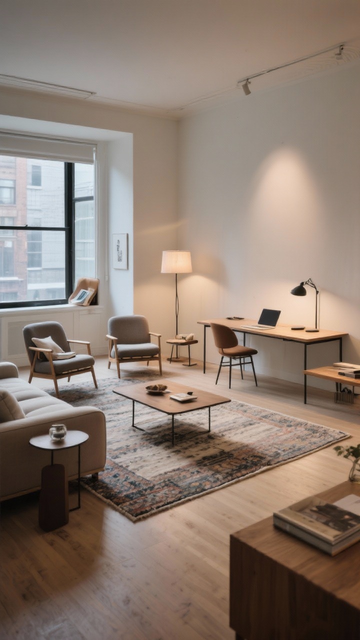
Bonus: floating pieces lets you sneak in a narrow console table behind the sofa—hello, extra storage without bulk.
2. Create Clear Pathways (No Obstacle Course)
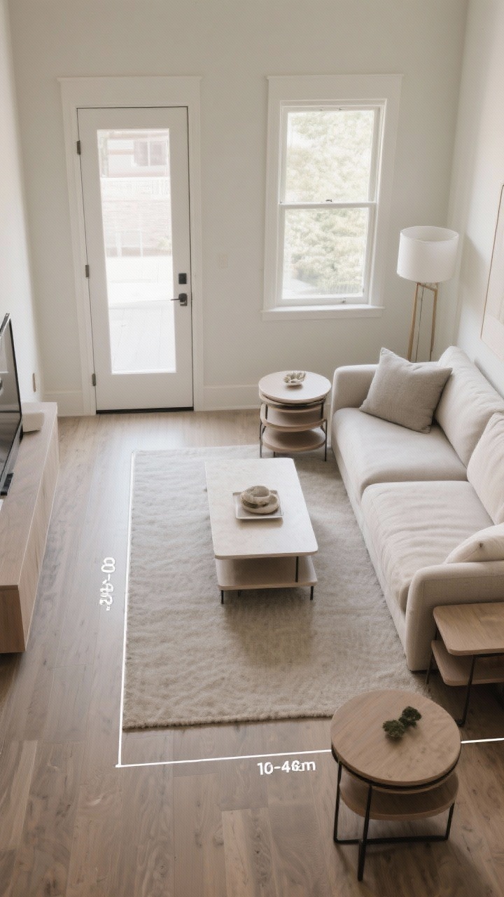
Nothing shrinks a room faster than zigzagging around furniture. Define a clean traffic flow so people can move without side-shuffling. Your space will instantly feel calmer and bigger.
How To Do It
- Map the route: From door to sofa to window—designate a straight or gentle curve path that’s 30–36 inches wide.
- Float the coffee table: Keep 14–18 inches between seating and table so knees don’t smack into corners.
- Corral extras: Nesting tables beat bulky end tables and can tuck away when not in use.
FYI: If people constantly cut through the center of your seating area, the layout’s fighting the architecture. Nudge the group slightly to one side and let the natural walkway exist.
3. Go Diagonal For Instant Drama
Want a bigger-feeling room without buying anything? Angle your furniture. Placing the sofa or rug at a slight diagonal tricks the eye into “reading” more depth.
How To Do It
- Anchor a corner: Angle the sofa toward the room’s focal point (fireplace, window, TV). Two armless chairs can mirror that angle.
- Turn the rug: Rotating a rectangular rug 10–15 degrees adds movement and breaks boxy lines.
- Keep the corners clear: Use tall plants or floor lamps in the “negative space” behind the sofa to lighten heavy corners.
It’s a tiny pivot with big payoff—like contour for your living room.
4. Zone It Like A Studio Apartment
One room, multiple jobs? Give each function its own “zone” so the space reads organized rather than cramped. Divide with rugs, lighting, and furniture orientation, not walls.
Smart Zones To Try
- Conversation zone: Sofa + 2 chairs facing each other across a coffee table.
- Reading nook: A small lounge chair, floor lamp, and side table near a window.
- Work pocket: Slim desk behind the sofa (aka a sofa table desk) with a task lamp.
Use consistent color tones across zones to keep the room cohesive. Different vibes, same family—like cousins who actually get along.
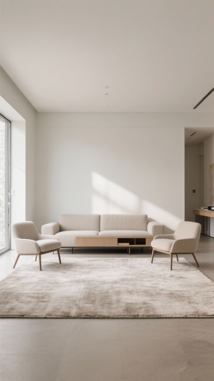
5. Symmetry With A Twist
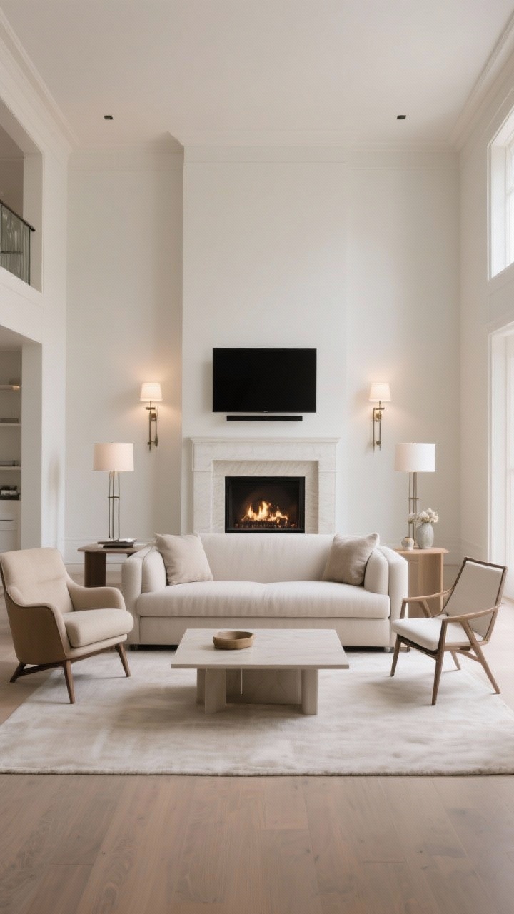
Symmetry calms visual noise, which makes a room feel bigger and more composed. But full mirror-image layouts can look stiff. Go 80% symmetrical and then break a rule for style points.
Layout Recipe
- Start with balance: Sofa centered on the focal point, matched lamps or sconces on both sides.
- Add contrast: Pair one upholstered chair with one open-frame chair to lighten the look.
- Keep the center low: A low-profile coffee table keeps sightlines open across the room.
Symmetry draws the eye outward and upward—exactly what you need to fake more space.
6. The L-Shape Power Move
An L-shaped layout is the small living room’s best friend. It carves out a conversation corner and frees up walking space, especially in open-plan homes.
How To Place It
- Sofa + chaise or sectional: Place the longer piece along the longer wall and the chaise on the short side to “hug” the space.
- Mind the angle: Keep the inside of the L facing your focal point (TV or fireplace), with a rug bridging both pieces.
- Keep ends airy: Swap end tables for wall-mounted shelves or a C-table that slides under the sofa.
IMO, this layout nails comfort and flow without eating up precious floor space.
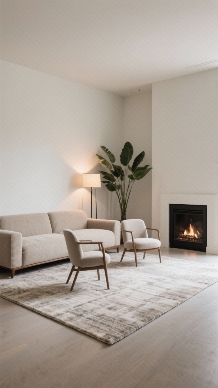
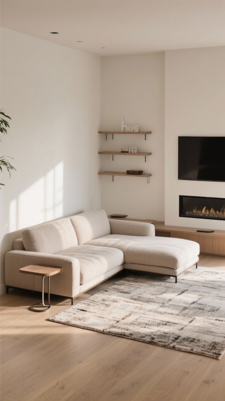
7. Low, Light, and Leggy
If your furniture is chunky and high-backed, your room will feel like it’s wearing a heavy winter coat. Choose lower profiles and visible legs to create air space and longer sightlines.
Pieces That Do The Most
- Sofas with 6–7 inch legs: That shadow line underneath is visual magic.
- Armless or slipper chairs: They read smaller but still comfy.
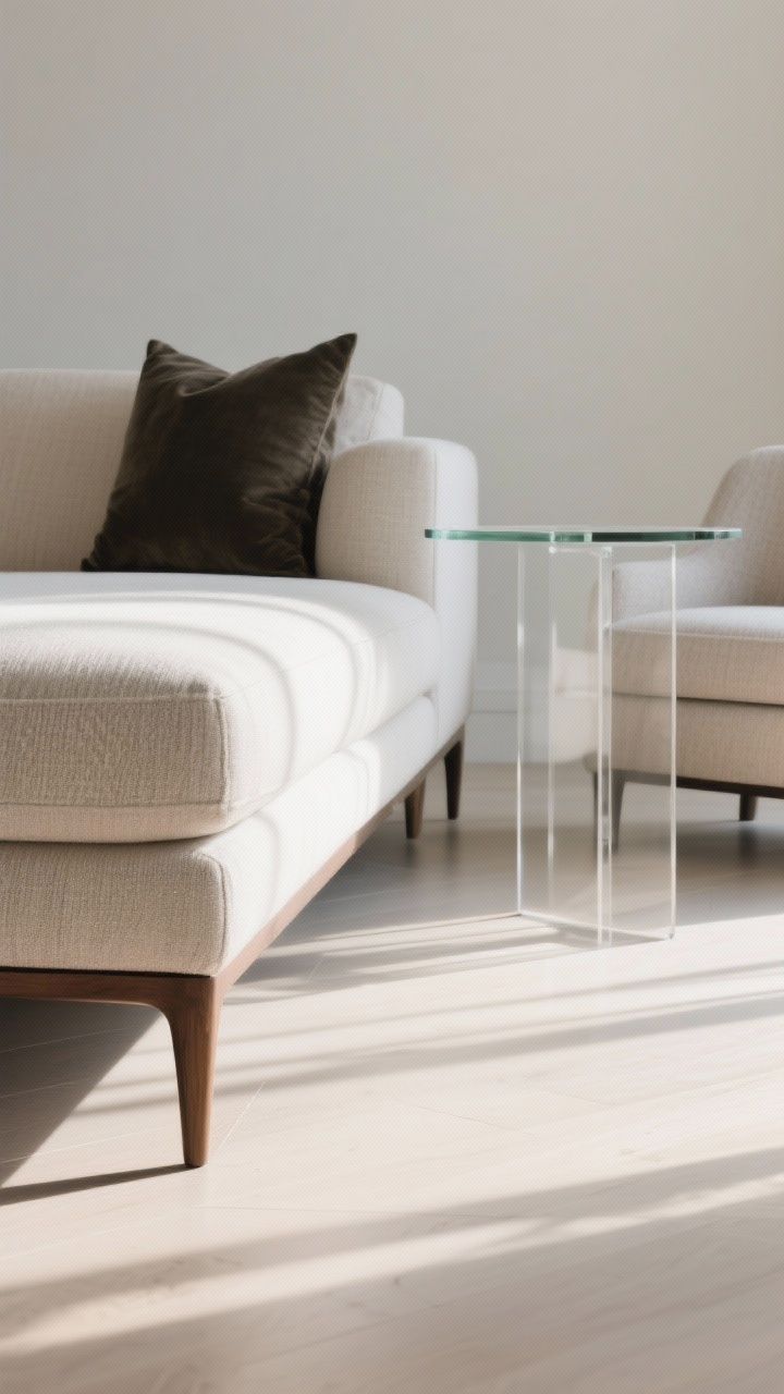
- Glass or acrylic tables: The surface disappears so the room looks larger.
And keep the palette light-to-mid. Dark, heavy fabrics can be gorgeous, but use them as accents so the room doesn’t feel weighed down.
8. The Rule Of Thirds (But For Rooms)
Photographers use the rule of thirds to balance a frame. It works on living rooms too. Imagine your room grid into thirds horizontally and vertically, then place big pieces along those lines.
Put It Into Practice
- Place the sofa on a third: Not smack in the center—just a tick off-center feels intentional and opens a wider path.
- Cluster decor at intersections: Floor lamp, plant, or side chair where lines “cross” for natural focal points.
- Stack heights: Keep most pieces low, add one tall element (bookcase or tree) at a third to pull the eye up.
Balanced rooms read as bigger because your brain isn’t scanning for what feels “off.” This layout quietly nails it.
9. Mirror, Mirror, Make It Wider
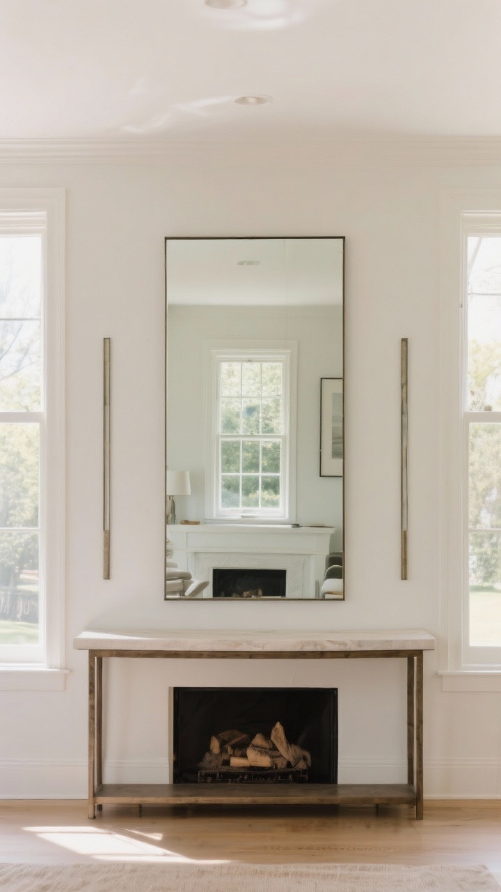
Mirrors aren’t just for selfies—they’re spatial sorcery. Strategic mirror placement bounces light, doubles sightlines, and visually widens narrow rooms.
Where To Hang Them
- Opposite a window: Doubles the view and daylight. Instant “second window.”
- Behind a console: A large, simple mirror creates depth without stealing attention.
- Flanking the fireplace: Slim vertical mirrors lift low ceilings by pulling eyes upward.
Keep frames simple and thin so the mirror reads as architecture, not a statement piece trying too hard. FYI, antique or smoked finishes can add warmth without harsh glare.
10. Layer Lighting Like A Designer
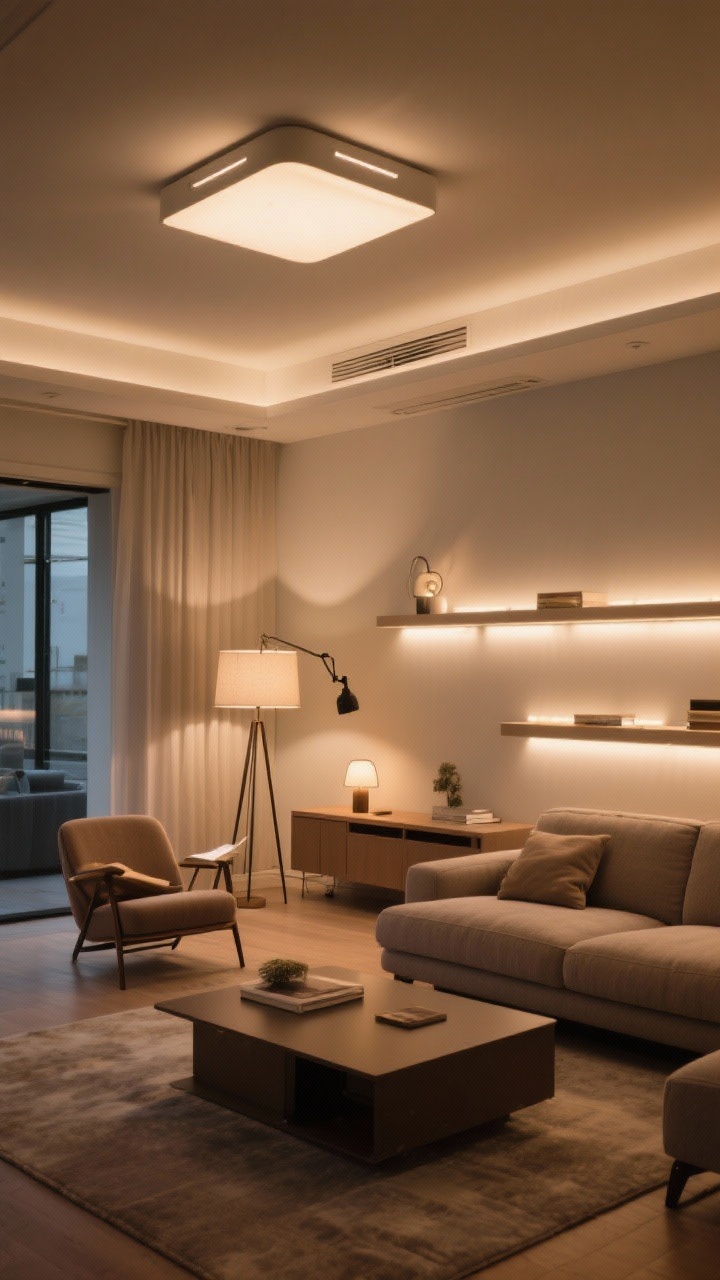
Flat overhead lighting shrinks a room—everything looks the same distance away. Layered lighting adds depth and zones, which translates to a bigger feel.
The Three Layers You Need
- Ambient: A flush mount or semi-flush for even glow (dimmers are non-negotiable).
- Task: Floor lamp by a chair, swing-arm sconce near the sofa, or a plug-in picture light over art.
- Accent: Backlight shelves, add a small lamp on the console, or use LED strips under a floating media unit.
Place light sources at different heights so shadows create contrast and depth. Your square footage won’t change, but the vibes will—dramatically.
Quick Styling Extras That Make Any Layout Feel Bigger
- Raise the curtains: Hang them 6–10 inches above the window and wide of the frame to fake taller ceilings and wider windows.
- Mind the media unit: Wall-mount the TV and use a floating console to reveal more floor.
- Edit the color palette: Stick to 2–3 main colors plus one accent. Less visual noise = more visual space.
- Use oversized art sparingly: One big piece beats a clutter of tiny frames.
- Round it out: A round coffee table or ottoman softens corners and improves flow.
Bottom line: You don’t need a bigger living room—you need a smarter layout. Start with one change (float the sofa, enlarge the rug, or rework your lighting) and see how the whole room breathes. You’ve got this, space wizard.