
Vintage Interior Design Style Color Palettes That Work
Vintage interiors have a special kind of confidence: colors feel lived-in, layered, and softly expressive, like they’ve always belonged together. The right palette can make even a simple room read as collected—warm, charming, and timeless without feeling themed.
Below is a gallery of vintage-friendly color palettes that consistently work in real homes. Each one is a distinct moodboard moment—paint-forward, easy to picture, and designed to make your space feel instantly storied.
Idea 1: Creamy Ivory + Tea-Stain Beige + Aged Brass
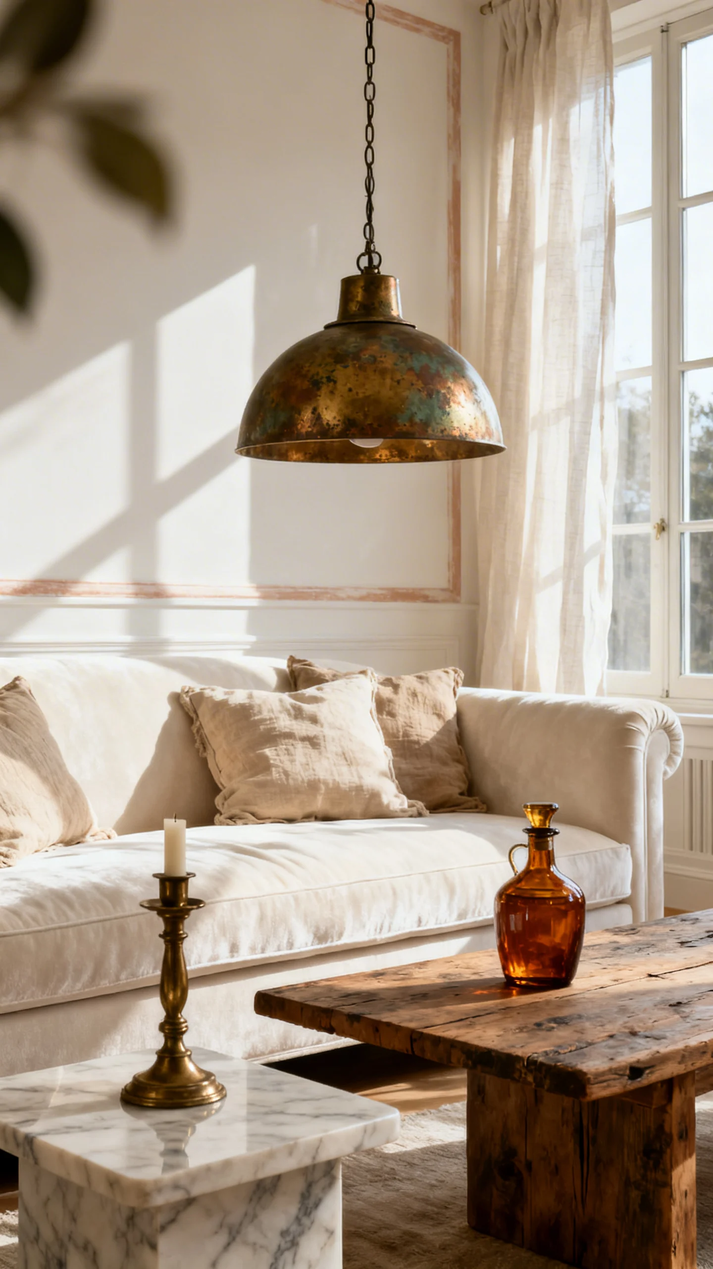
This is vintage at its most effortless: walls in creamy ivory, trim leaning warm (never stark), and a quiet layer of tea-stain beige in upholstery, rugs, or drapery. The whole room glows like afternoon light in an old apartment with tall windows.
Finish it with aged brass—think picture lights, candlesticks, and classic hardware—plus a touch of dark wood for grounding. It reads elegant, European, and softly nostalgic, like a well-kept heirloom.
Idea 2: Dusty Rose + Warm Taupe + Walnut Brown
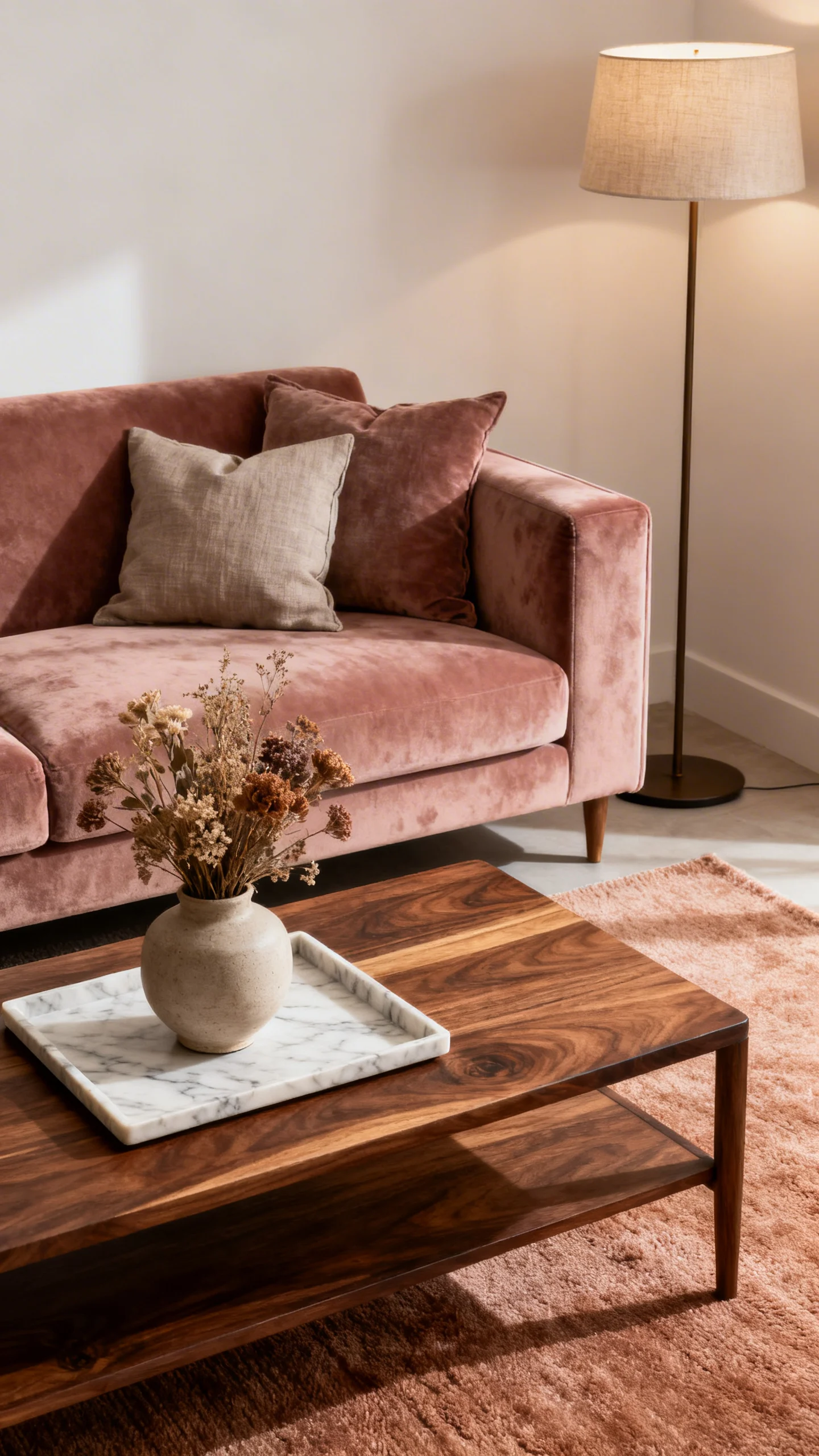
Dusty rose is the vintage color that never tries too hard—especially when it’s muted and slightly grayed. Pair it with warm taupe on adjacent walls or in textiles for that “powder room meets parlor” romance.
Walnut brown brings the grown-up balance: a vintage dresser, a curved headboard, a coffee table with patina. The vibe is intimate and plush, with a quiet, old-soul softness.
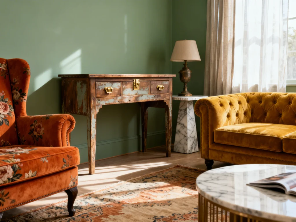
Idea 3: Sage Green + Buttercream + Matte Black Accents
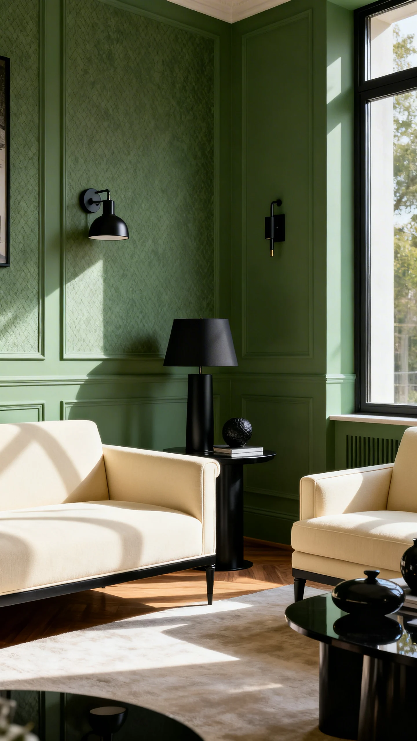
Sage green feels like a painted hutch, a garden room, and a thrifted vase all at once. Use it on walls for an instant vintage base, then bring in buttercream through lampshades, ceilings, or cozy textiles to keep the space warm and bright.
Matte black accents add definition—thin frames, vintage-inspired sconces, or an iron bed. The contrast keeps it crisp while the palette stays gentle, grounded, and classic.
Idea 4: Pale Blue-Gray + Linen White + Tarnished Silver
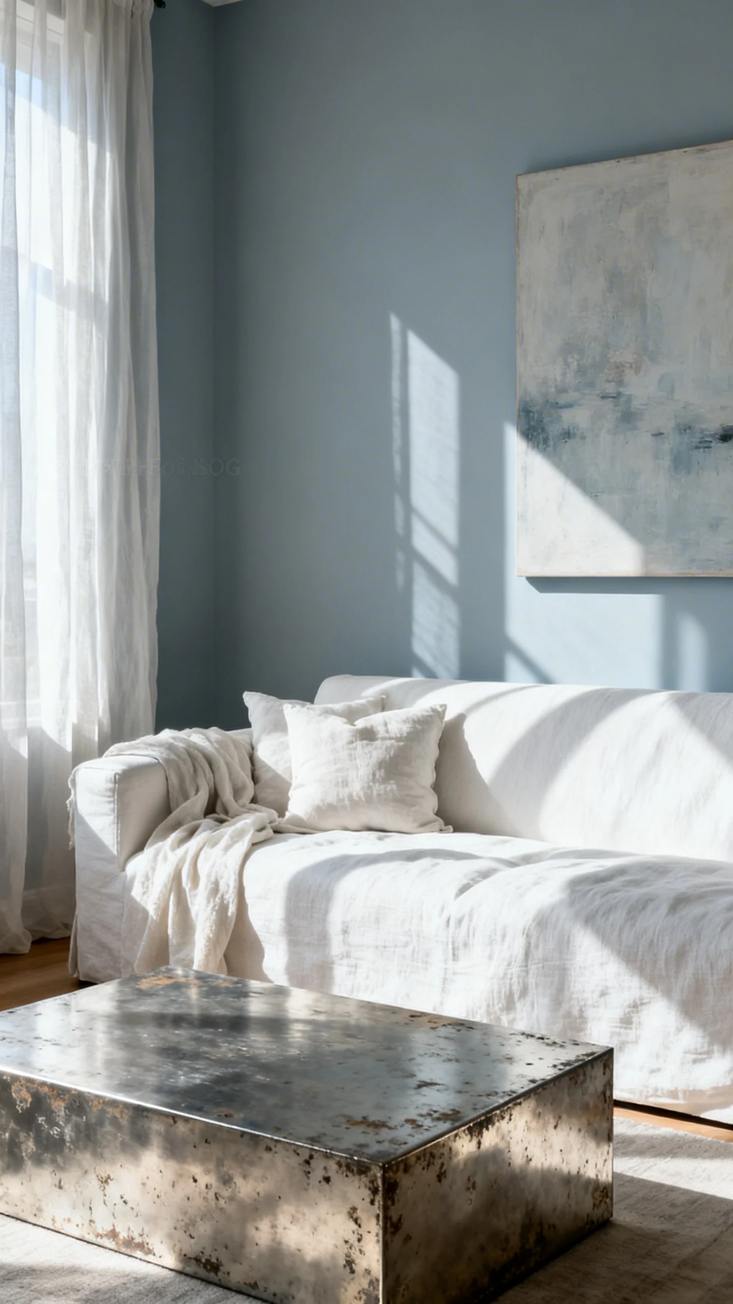
This palette feels like a rainy-day antique shop find: pale blue-gray walls with linen white trim, airy curtains, and slipcovered seating. It’s calm, slightly formal, and perfect for rooms with vintage molding or tall baseboards.
Tarnished silver (or pewter) brings in that subtle gleam—mirrors, trays, candlesticks—without going flashy. Add a faded floral or a small stripe to make it feel truly “collected over time.”
Idea 5: Ochre Gold + Tobacco Leather + Chalky White
Ochre gold is sunshine with history—a color that looks especially right on plaster walls or in a soft, velvety finish. Pair it with tobacco leather (a chair, ottoman, or bench) and you get a vintage lounge vibe that feels tailored and warm.
Chalky white keeps it from getting heavy: think white-painted bookcases, simple trim, or a light rug. The overall mood is late-’60s meets timeless, with a cozy, library-like depth.
Idea 6: Deep Olive + Cream + Rust Terracotta
Deep olive is moody vintage done right—rich, earthy, and instantly architectural. Set it against creamy whites for trim and upholstery, then sprinkle in rust terracotta through pottery, textiles, or an accent chair for a sunbaked, old-world warmth.
This palette looks amazing with patina: worn wood, aged frames, vintage oil paintings, and woven textures. It’s dramatic but welcoming, like a room that’s always ready for candlelight.
Idea 7: Lavender Gray + Antique White + Honey Oak
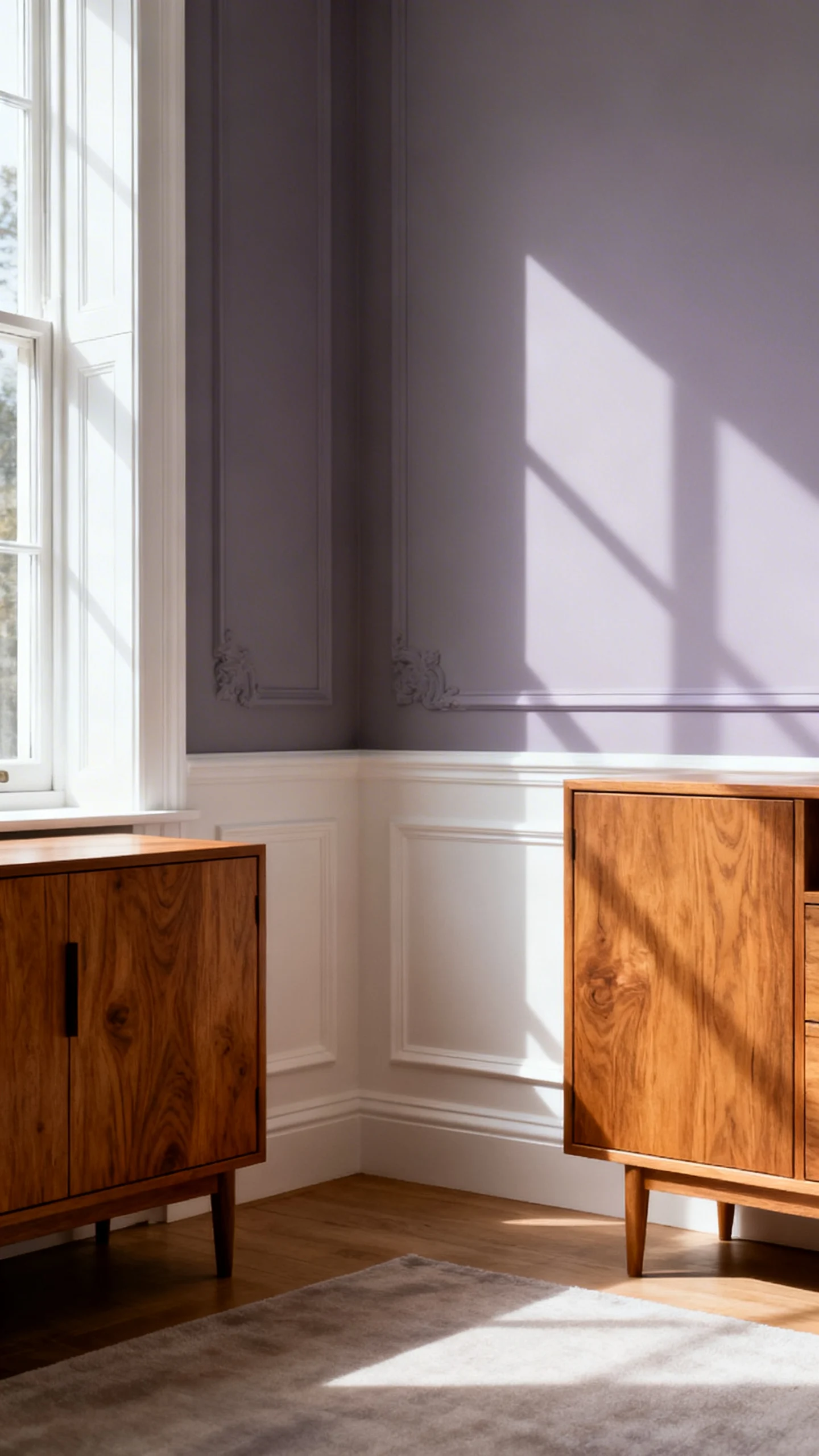
Lavender gray is a secret weapon for vintage style—it reads romantic but sophisticated when it’s muted. On walls, it creates that “faded boudoir” feeling, especially when paired with antique white bedding, trim, or upholstery.
Honey oak brings in the era-specific warmth that makes it feel authentic: a vintage vanity, oak floors, or a simple wood frame. The vibe is soft-focus and dreamy, like a treasured photograph.
Idea 8: Brick Red + Warm Beige + Dark Green
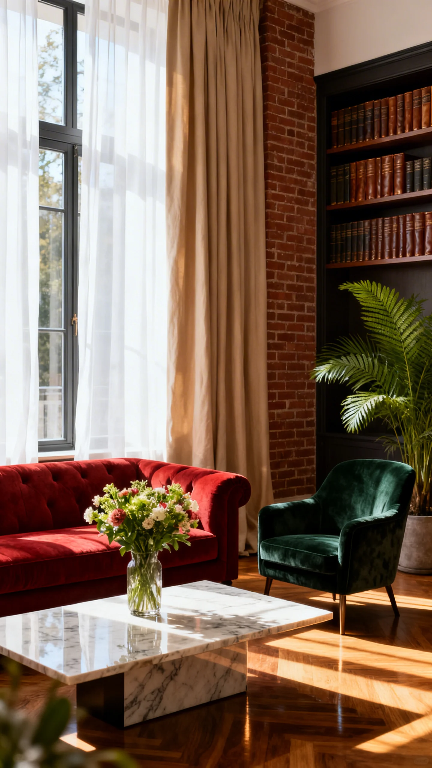
Brick red is confident, nostalgic, and surprisingly versatile when it’s softened into a clay-like tone. Pair it with warm beige to keep the room grounded and livable—think beige walls with brick-red accents, or vice versa.
Dark green adds that heritage edge: a painted cabinet, velvet pillows, or classic botanicals. Together, the palette feels like a vintage dining room in a townhouse—rich, inviting, and full of character.
Idea 9: Pale Peach + Soft Brown + Champagne Gold
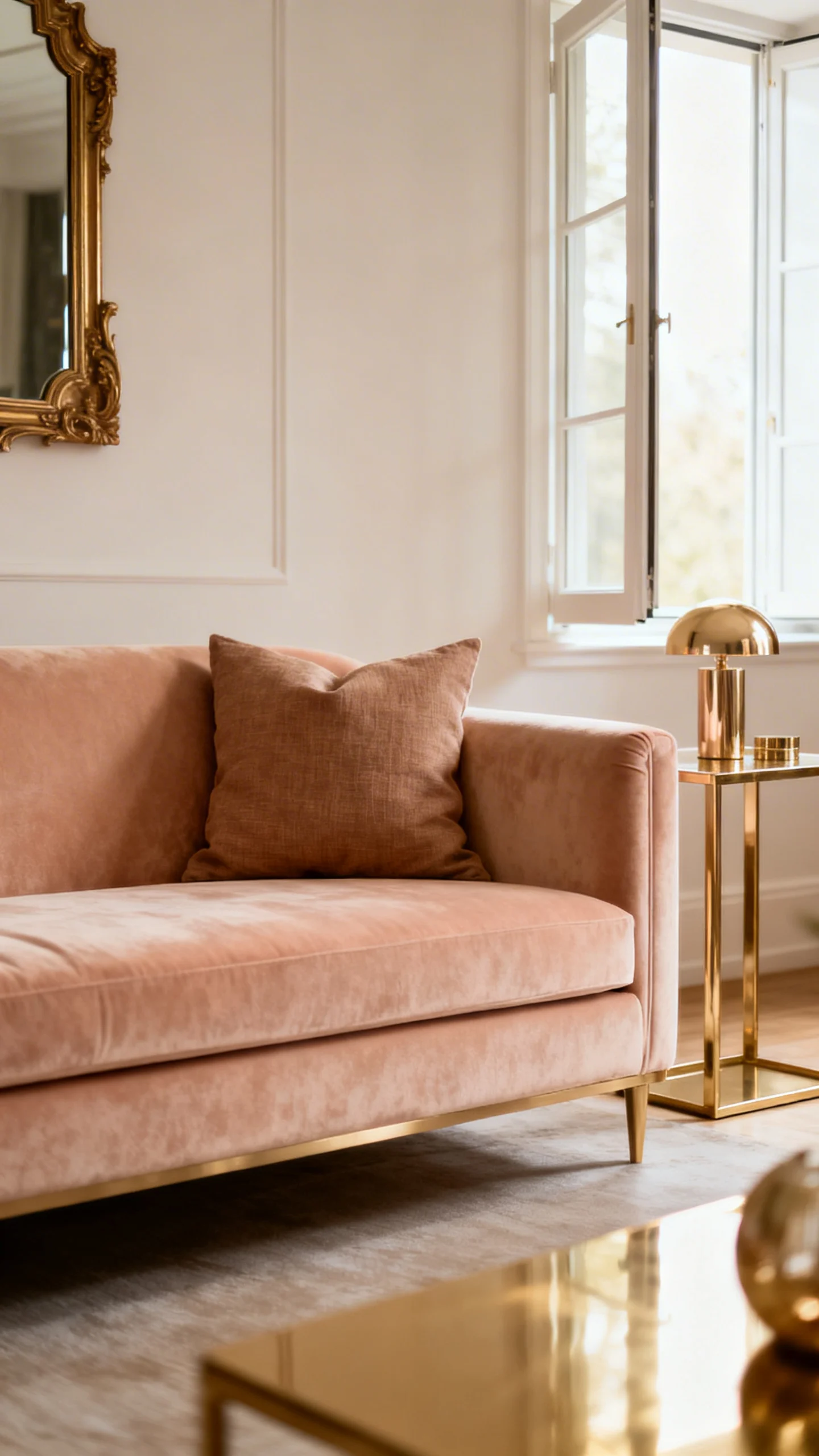
Pale peach brings a gentle glow that feels unmistakably vintage—flattering, warm, and a little bit whimsical. It pairs beautifully with soft browns (mocha, mushroom, cocoa) in furniture and woven textures for a grounded, cozy effect.
Champagne gold finishes it with a delicate shimmer: curved mirrors, petite hardware, and warm-toned lighting. The mood is charming and feminine without being overly sweet—like a well-loved vintage perfume bottle, translated into paint.
Idea 10: Navy Ink + Crisp Cream + Cherrywood
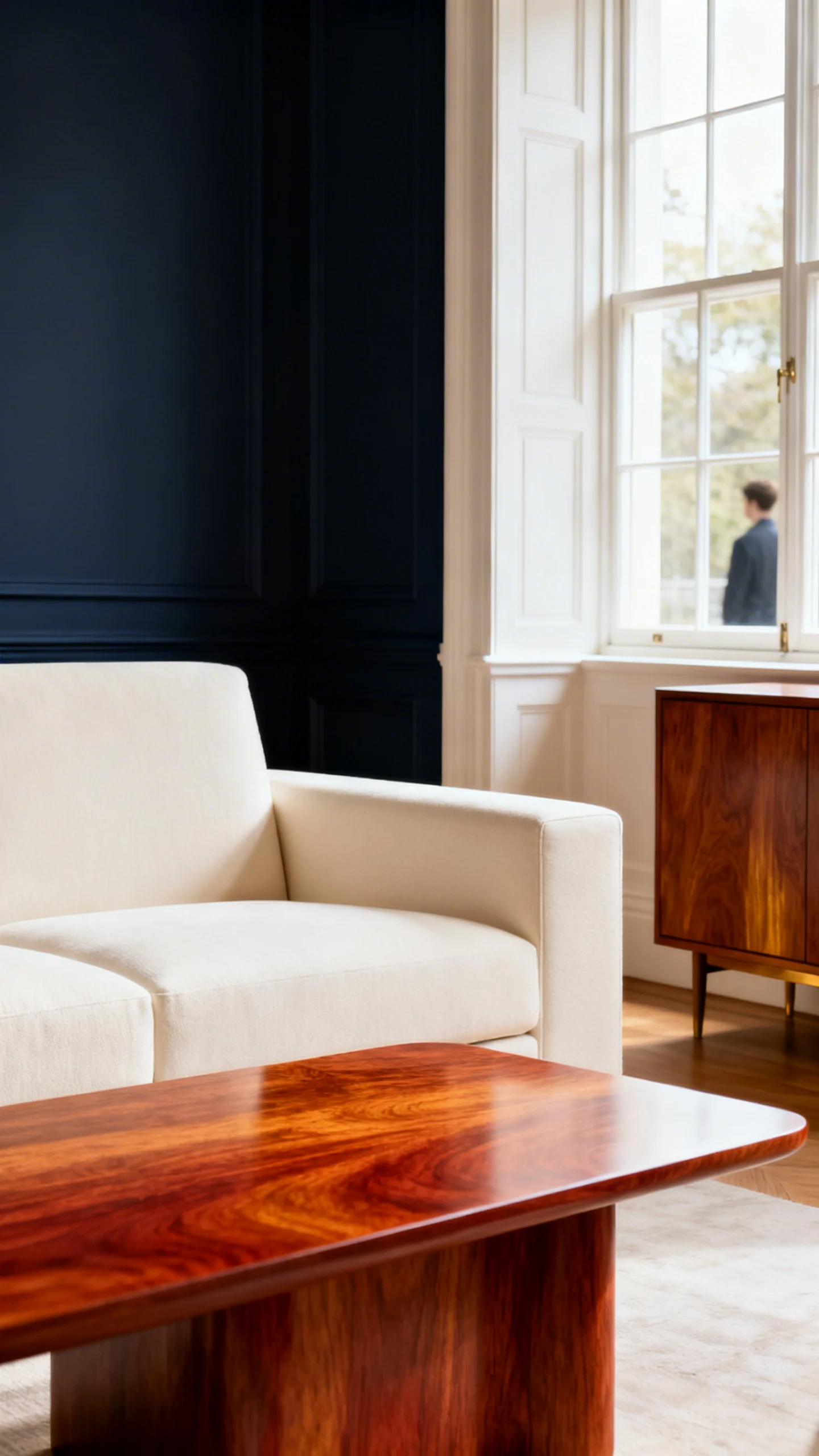
Navy ink is vintage drama with polish—especially in rooms with paneling, built-ins, or picture rails. Set it against crisp cream to highlight architectural details and make the deep tone feel intentional rather than heavy.
Cherrywood (or any red-toned wood with depth) brings in that classic, collected richness—think vintage sideboards, framed art, and layered textiles. The vibe is heritage, evening-ready, and undeniably timeless.
FAQ
What makes a color palette feel “vintage” instead of just neutral?
Vintage palettes often look slightly softened—think muted, warm, or gently grayed tones—plus finishes with character (patina metals, warm woods). The overall effect feels layered and lived-in, not flat or ultra-bright.
Do vintage color palettes have to be dark?
No. Many vintage-leaning rooms are light and airy, using creamy whites, gentle pastels, and warm neutrals. The vintage feeling comes from the undertones and pairings—like ivory with brass, or pale blue-gray with tarnished silver.
Which vintage palettes work best for small rooms?
Creamy ivory with warm beige, pale blue-gray with linen white, and pale peach with soft brown all tend to make small spaces feel inviting and bright. These palettes create warmth without visually shrinking the room.
How do I keep a vintage palette from looking too themed?
Choose one main paint color and let the supporting shades show up in smaller, quieter ways—textiles, art, and finishes. Mixing in modern silhouettes or simple lighting can also keep the mood fresh while the colors stay classic.
What metals look most authentic with vintage-inspired colors?
Aged brass, tarnished silver/pewter, and champagne gold are especially convincing with vintage palettes because they read warm and timeworn. Matte black works beautifully too, adding contrast while still feeling classic.