
Furniture Remodeling on a Budget That Looks Custom
Want that “made-for-your-home” furniture look without paying custom prices? The secret is remodeling what you already own (or what you can thrift) with a few high-impact, decor-forward upgrades that photograph like boutique pieces.
Below are 10 budget-friendly approaches that focus on the finished vibe: color, texture, and styling details that make a basic dresser, table, bookcase, or cabinet look intentional, elevated, and totally you.
1) Give It a One-Color “Boutique” Paint Moment
The quickest way to make a piece look custom is a confident, single-color makeover that feels curated—like it came from a small design studio. Think moody olive, inky charcoal, soft greige, or warm putty. The result reads clean, modern, and expensive, especially when you keep the styling minimal and tonal.
Action steps: Choose one sophisticated shade and repeat it in the styling (a vase, a candle, a framed print). Finish the look with a simple, uncluttered top: one tall object + one low object + negative space.
2) Create a “Luxe Contrast” Two-Tone Effect
Two-tone furniture looks like a designer special order—especially when you pair a grounded base with a lighter, airier top. Picture a creamy top with a deep taupe body, or a black lower section with a warm white upper. The contrast adds structure and makes even a thrifted piece feel architectural.
Action steps: Keep your palette tight (two neutrals or one neutral + one muted color). Style with mixed materials—ceramic + glass + a little brass-toned decor—to echo that intentional contrast.
3) Add “Wallpaper Energy” Inside Shelves or On Drawer Fronts
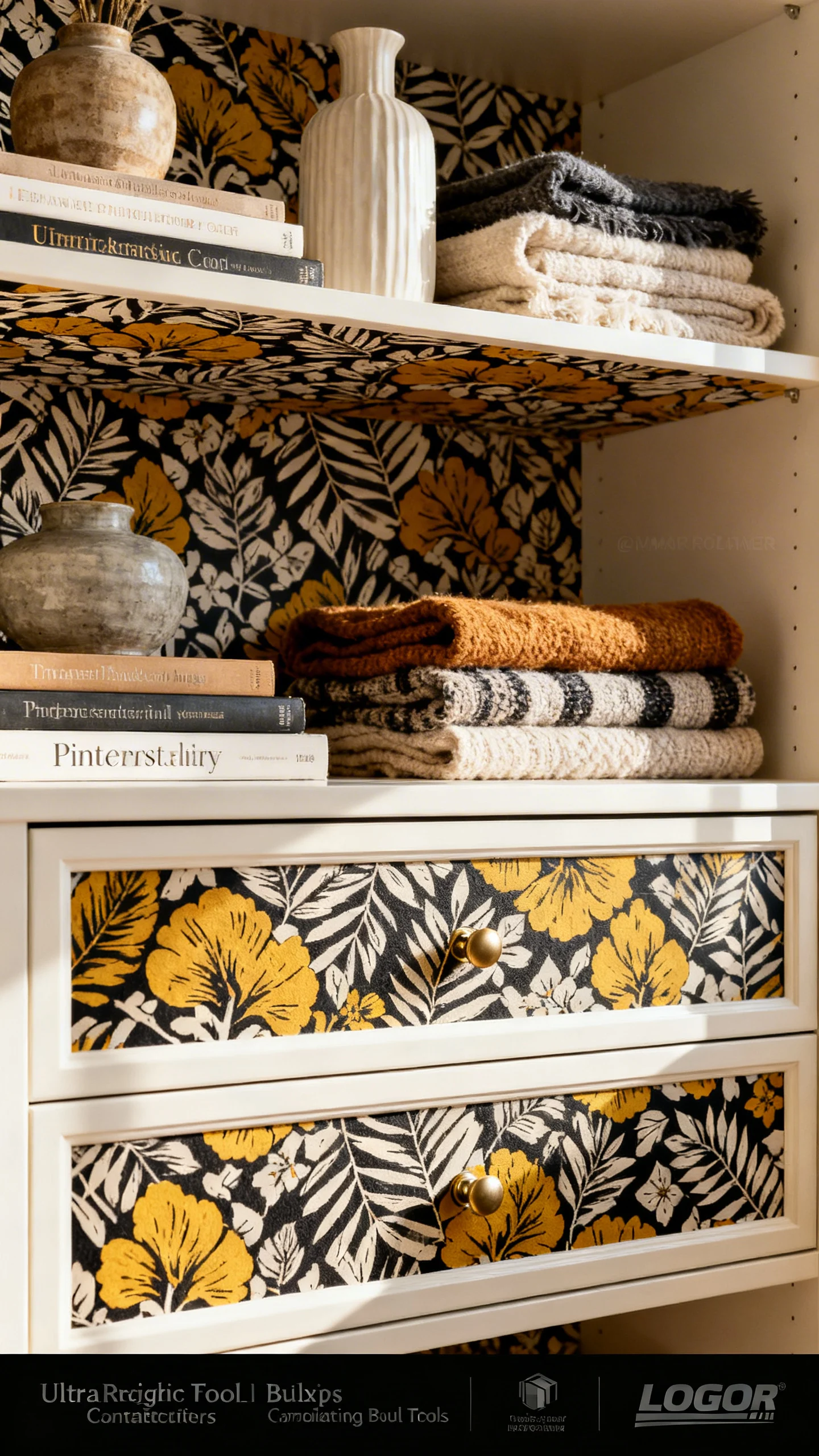
Want the wow factor people assume is custom millwork? Add pattern where it feels like a surprise: the back of a bookcase, the inside of a cabinet, or even drawer fronts. A soft block print, subtle grasscloth look, or modern stripe instantly upgrades the piece into something that feels collected and high-end.
Action steps: Use peel-and-stick wallpaper or removable liner for a budget-friendly transformation. Repeat one color from the pattern in your styling (book spines, a small bowl, or a framed photo) for a pulled-together look.
4) Lean Into a “Textural Neutral” Finish for a Calm, Custom Vibe
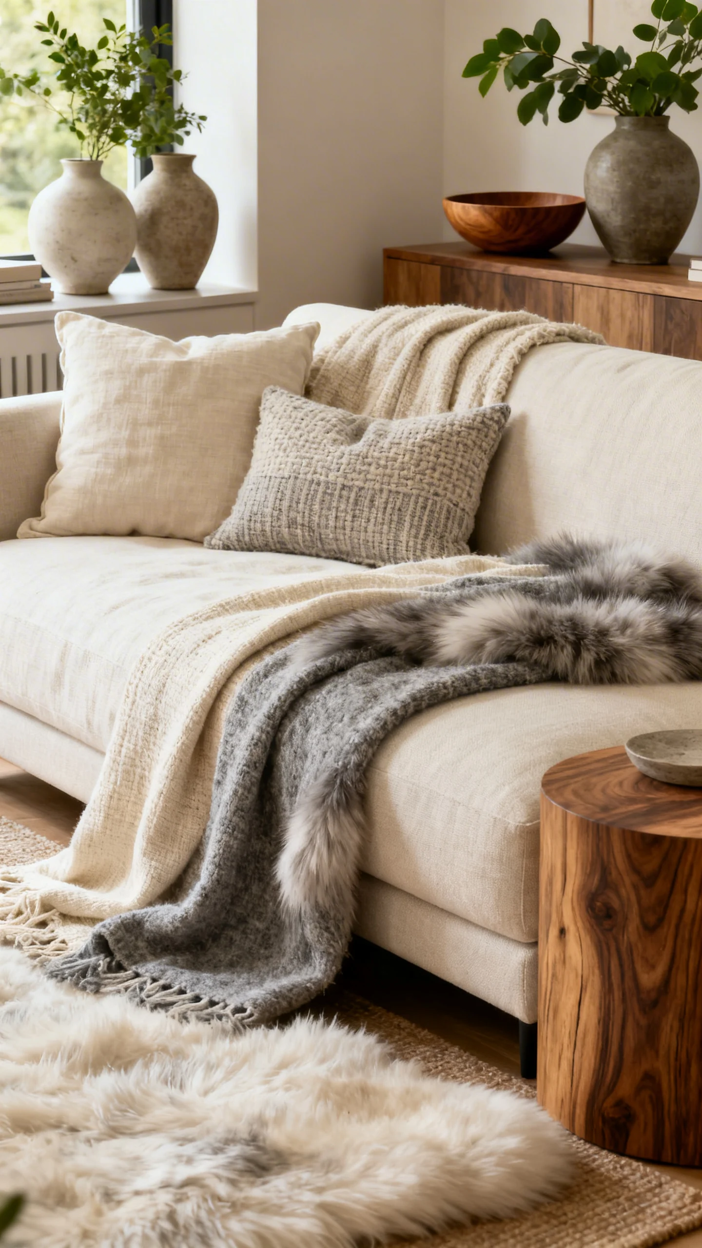
Custom-looking furniture often isn’t loud—it’s tactile. A textured neutral finish (think sandy beige, mushroom, soft clay, or warm white) gives that serene, design-forward feel you see in magazine homes. The piece looks like it belongs in a curated, slow-living space.
Action steps: Choose a warm neutral paint and layer the styling with texture: a linen runner, a woven basket, and a matte ceramic lamp. Keep accessories in soft whites, warm woods, and muted stone tones for a cohesive, elevated calm.
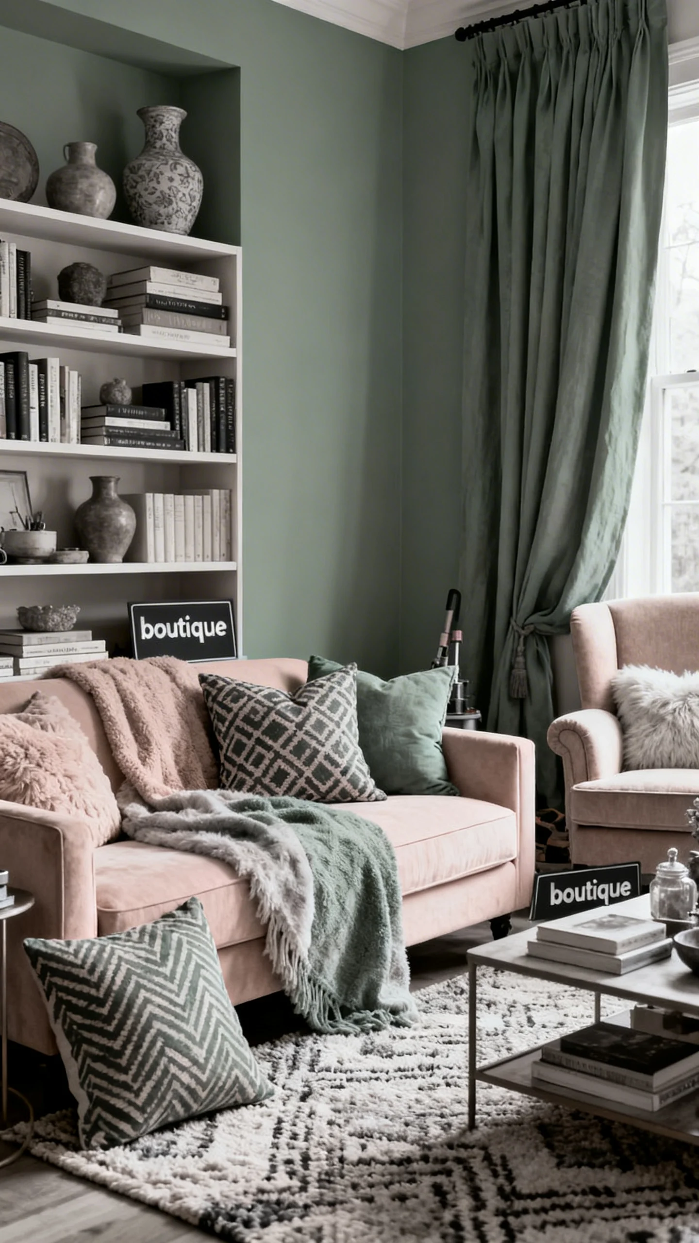
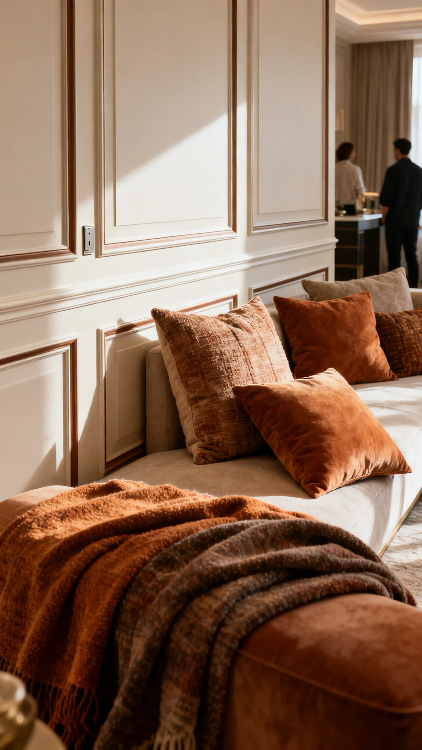
5) Turn Basic Storage Into a “Statement Sideboard” With Styling
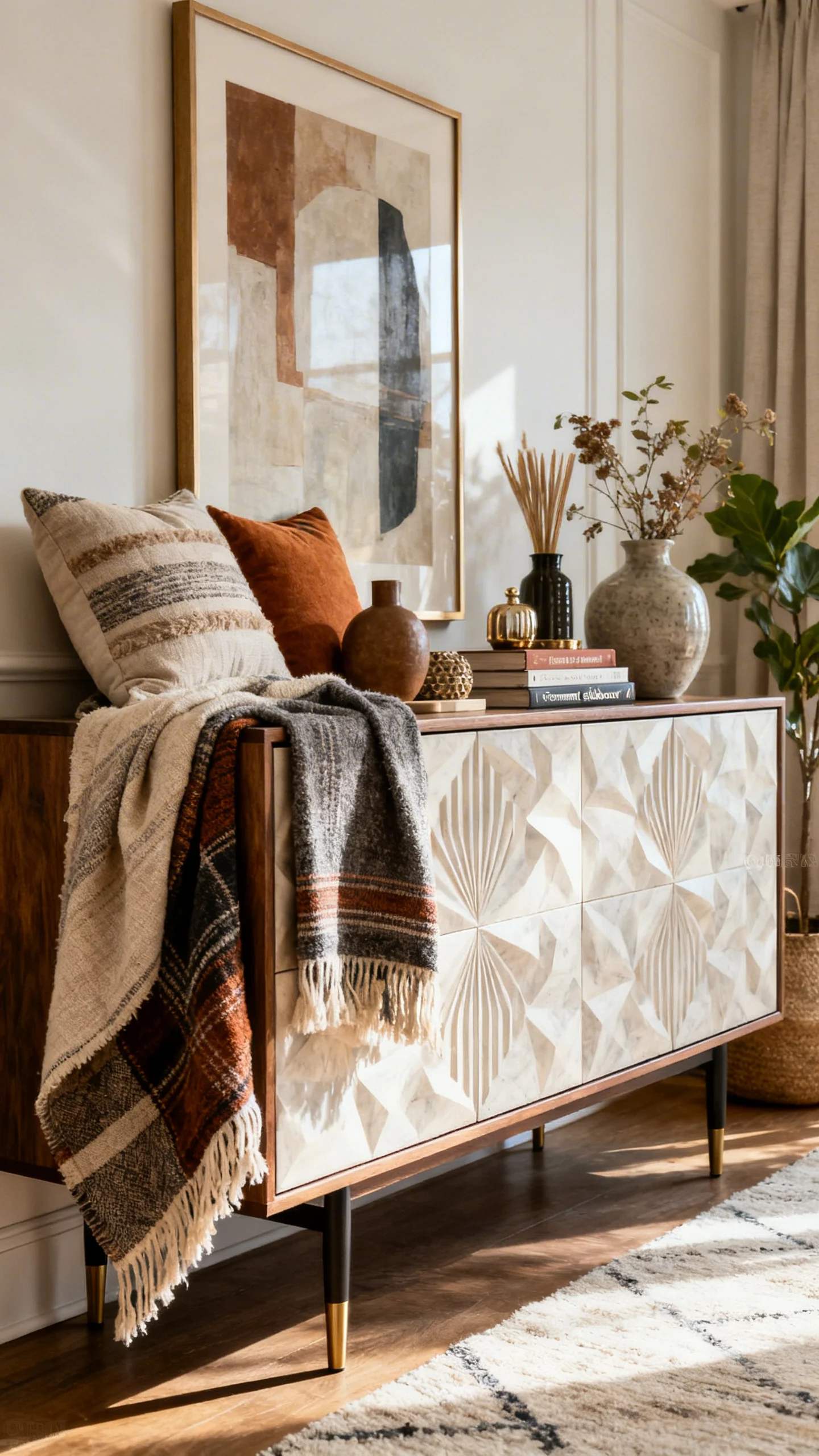
A budget cabinet or dresser can read like a custom sideboard when styled with intention. The final look: a grounded anchor piece that makes the room feel finished—perfect under a wall mirror, a gallery wall, or oversized art.
Action steps: Style the top with a three-part formula: something tall (lamp), something organic (branches or greenery), and something personal (stacked books with a small object on top). Keep the palette consistent—black + ivory + warm wood is a foolproof “designer” mix.
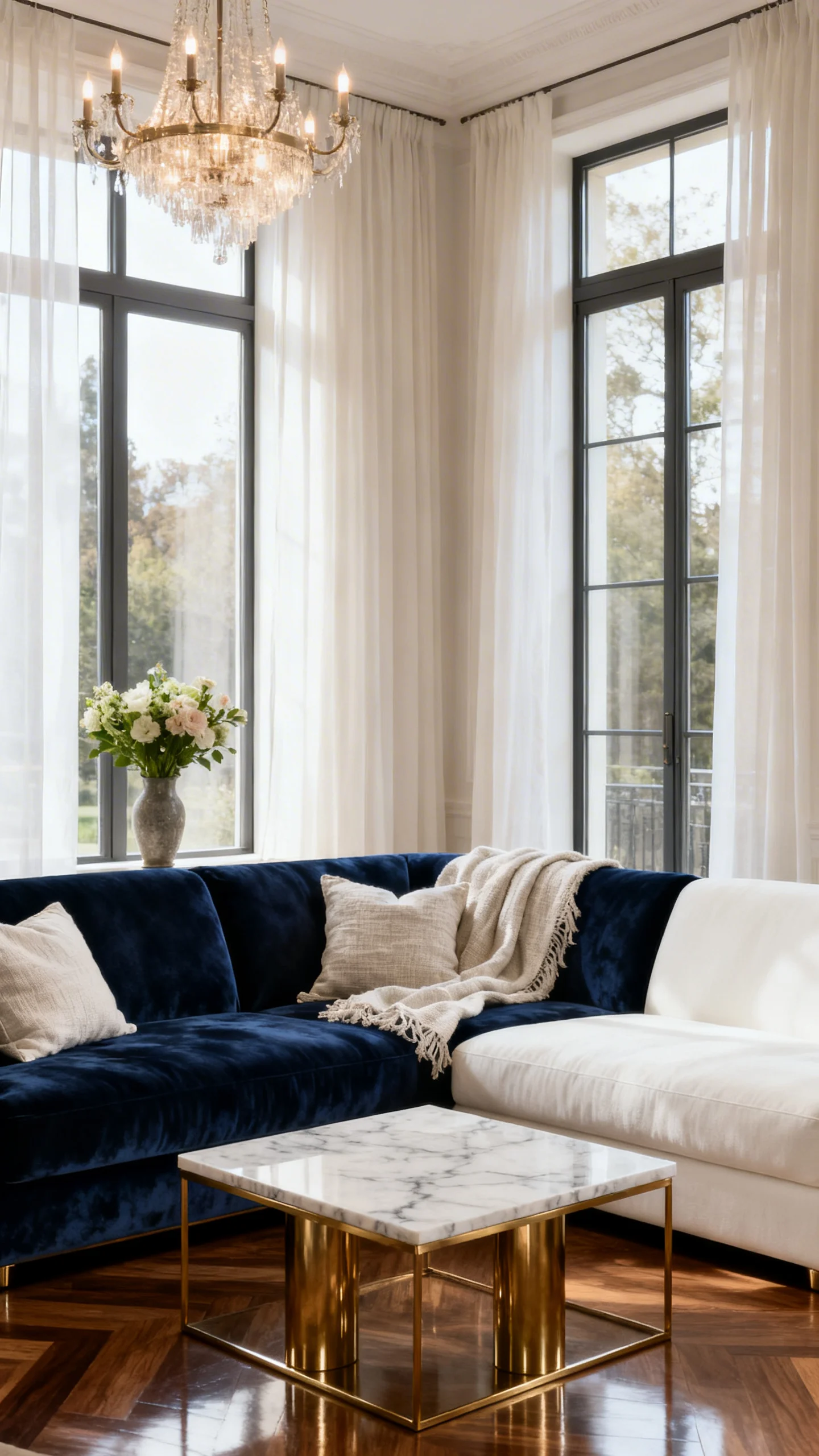
6) Make It Look Built-In (Without Making It Built-In)
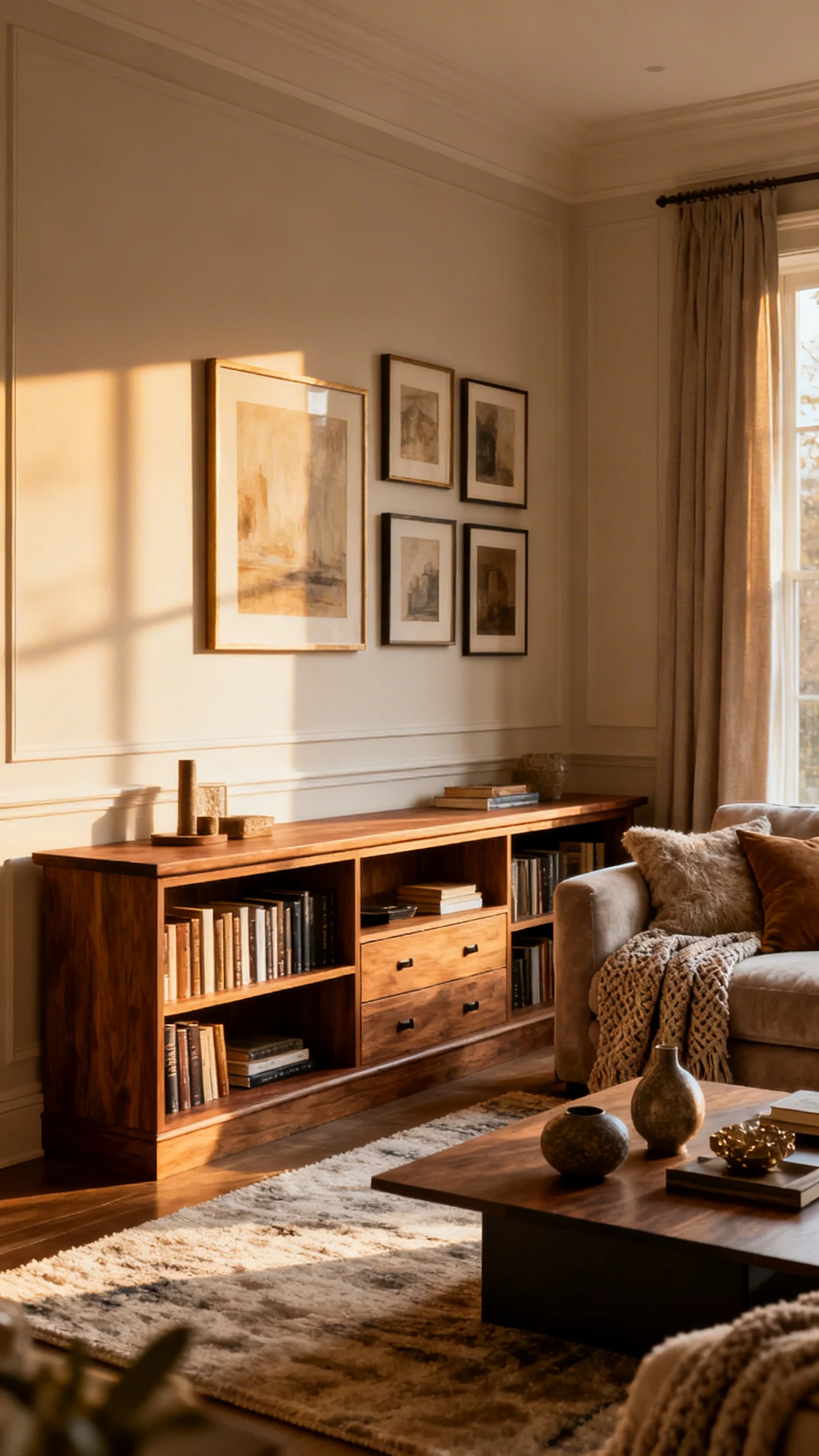
That custom look everyone loves? Built-ins. But you can get the vibe without a full renovation by placing a piece so it appears intentionally “installed.” Think bookcases flanking a sofa, matching cabinets side-by-side, or a dresser centered perfectly under art with balanced lamps.
Action steps: Create symmetry: two matching lamps, twin baskets, or a pair of frames. Add a single oversized art piece above to “lock in” the layout and make the furniture feel planned—not placed.
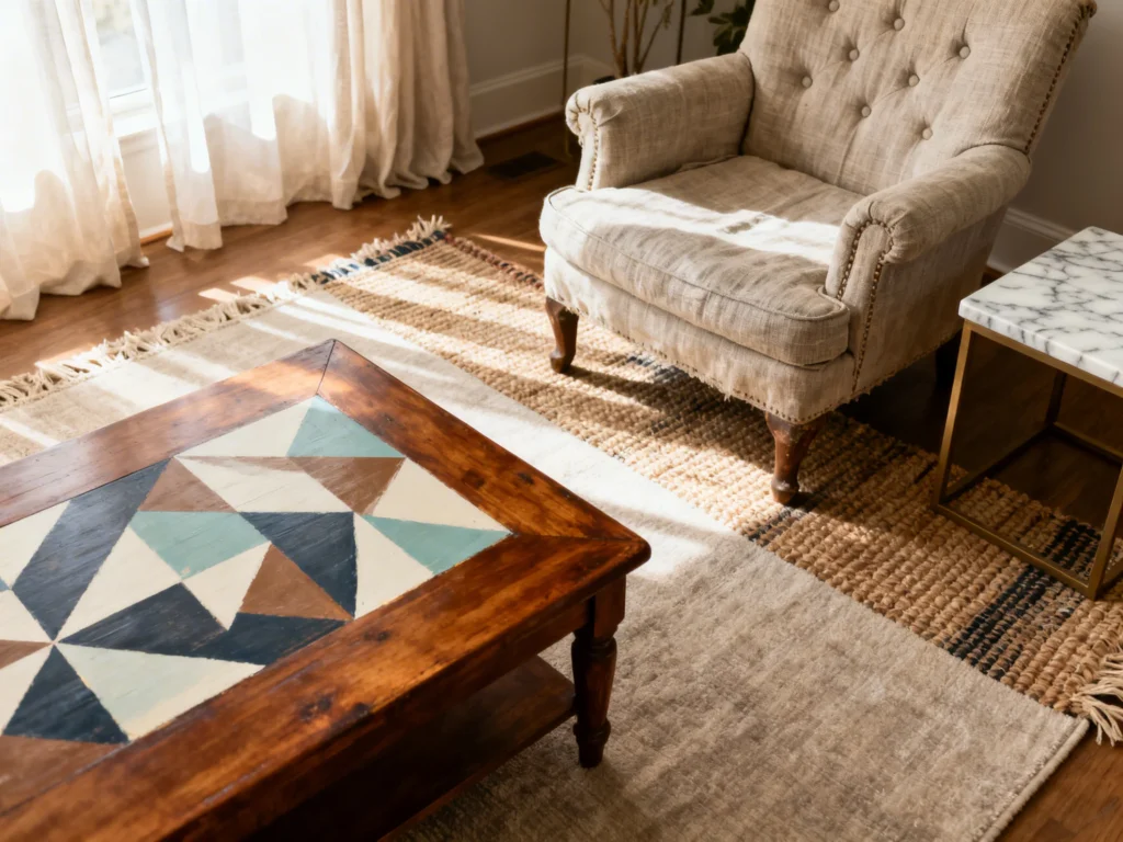
7) Upgrade With a “Stone Look” Topper (Faux, Budget-Friendly, Chic)
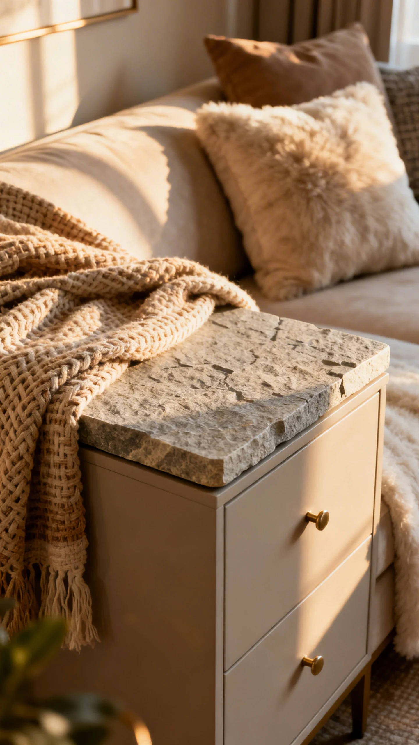
A stone top reads instantly custom—like an heirloom console or a vintage European commode. The affordable version is all about the illusion: a marble-look, travertine-look, or soapstone-look surface that elevates the silhouette and makes everyday furniture feel collected.
Action steps: Use a marble-look removable film or a stone-look tray to create that polished surface moment. Style with a small stack of books and a single sculptural object (a knot, a sphere, or a curved vase) for gallery-like restraint.
8) Add Trim Details for “Designer Paneling” Energy (Simple + High Impact)
Furniture that looks custom often has subtle dimension—panels, frames, and shadow lines that catch light. Adding simple trim shapes to flat surfaces can create a tailored, bespoke feel, like a piece that was made to match your home’s architecture.
Action steps: Keep the trim design clean (think symmetrical rectangles) and paint everything the same color for a seamless, high-end finish. Then style with polished accents—glossy ceramics, a mirror, or a softly glowing lamp—to highlight the new dimension.
9) Go “Vintage European” With a Soft, Aged Palette
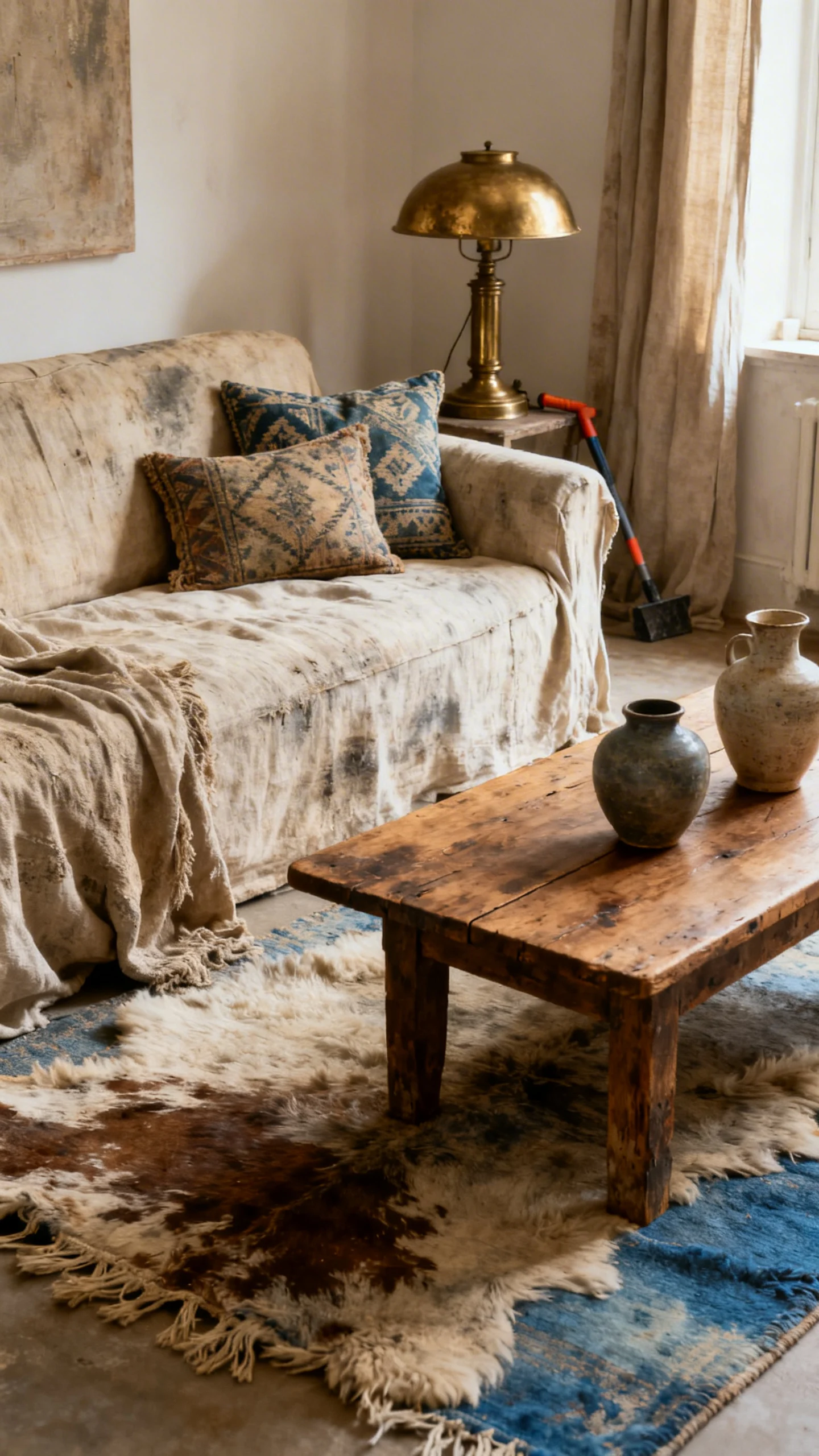
If you love romantic, collected interiors, lean into a vintage European vibe: dusty blue, muted sage, antique white, or pale taupe. The piece looks storied and special—like it came from a charming shop you found while traveling.
Action steps: Choose a softened color (not too bright) and pair it with aged-looking styling: a brass-toned candlestick, an ornate frame, or a small floral painting. Finish with a simple bouquet (real or faux) in creamy whites and soft greens.
10) Make Thrifted Pieces Look “Curated” With Cohesive Pairing
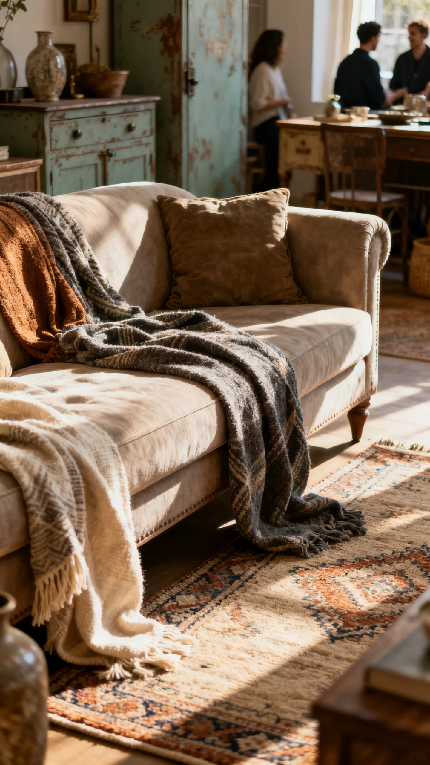
One thrifted piece is great—two coordinated thrifted pieces look intentional and custom. The key is treating them like a set, even if they didn’t start that way. When the finishes and styling speak the same language, the room feels designed, not decorated.
Action steps: Pair similar silhouettes (two nightstands, two small cabinets, or a dresser + side table) and unify them with the same paint color or complementary tones. Style both with echoes: matching lampshades, repeated art colors, or twin baskets for that boutique “collected set” effect.
FAQ
What’s the most budget-friendly furniture remodel that still looks high-end?
A confident paint color in a sophisticated finish (think warm neutral, deep green, or charcoal) plus streamlined styling on top. Keeping the palette cohesive makes the piece look intentional and custom.
How do I choose a paint color that won’t look cheap?
Skip super-bright primaries and go for muted, complex tones: olive, clay, mushroom, greige, navy, or soft black. These shades photograph beautifully and feel more “designer” in natural light.
What patterns make furniture look custom instead of busy?
Look for subtle classics: thin stripes, small-scale block prints, tone-on-tone textures, or grasscloth looks. Use pattern in one contained area (like the back of a shelf) and keep the rest of the styling calm.
How do I style remodeled furniture so it looks finished for photos?
Use the “tall + medium + low” rule and repeat colors. Add one organic element (greenery or branches), one reflective or glossy element (glass, mirror, glaze), and leave a little negative space so it feels curated.
Can I make mismatched thrift finds look like a coordinated set?
Yes—unify them with the same color, similar styling, and repeated textures (like matching baskets or lampshades). Even different silhouettes can look custom when the finish and palette are consistent.