
Apartment Inspiration Using Neutral Color Palettes
Neutral color palettes have a quiet kind of power in an apartment: they make rooms feel bigger, calmer, and instantly more elevated. From creamy whites to putty beiges, mushroom taupes to warm greiges, neutrals create a backdrop that lets texture, light, and silhouette do the talking.
Below are 10 distinct neutral-forward apartment looks—each one a pin-worthy moodboard moment with its own vibe, finishes, and design personality. Save the ones that feel like your next chapter.
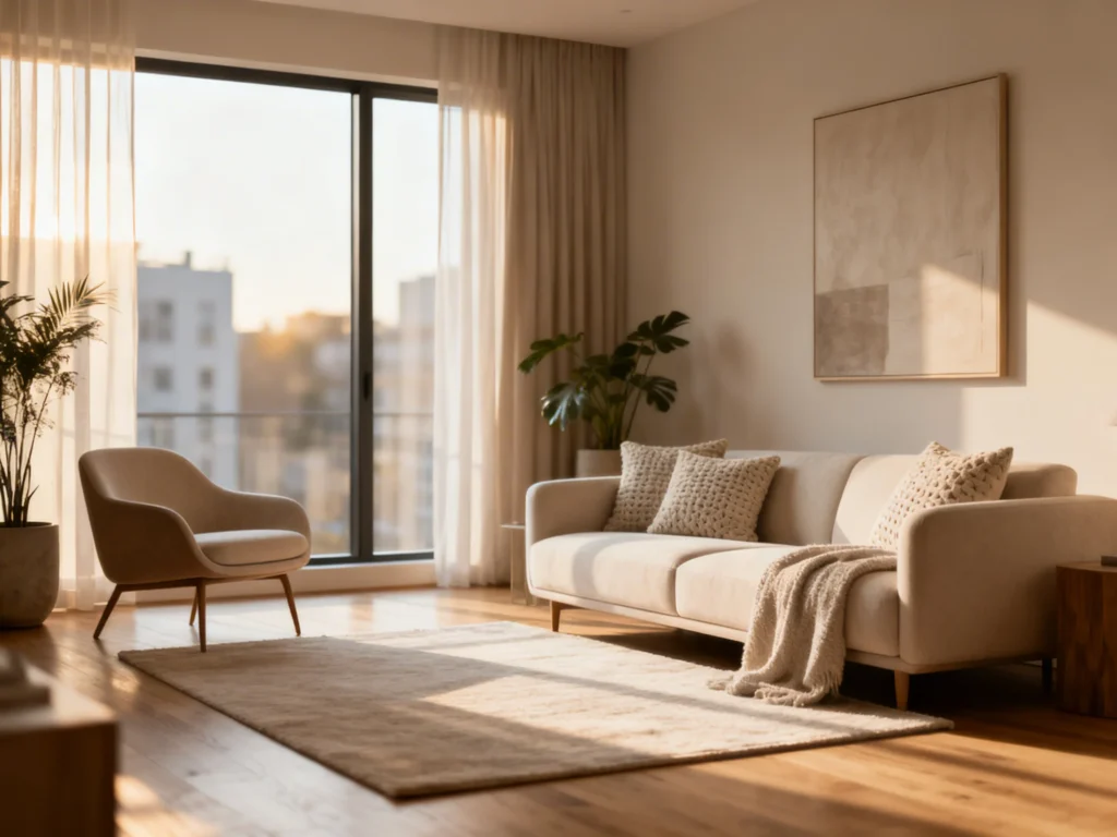
Idea 1: Airy Linen Living Room in Warm White + Sand
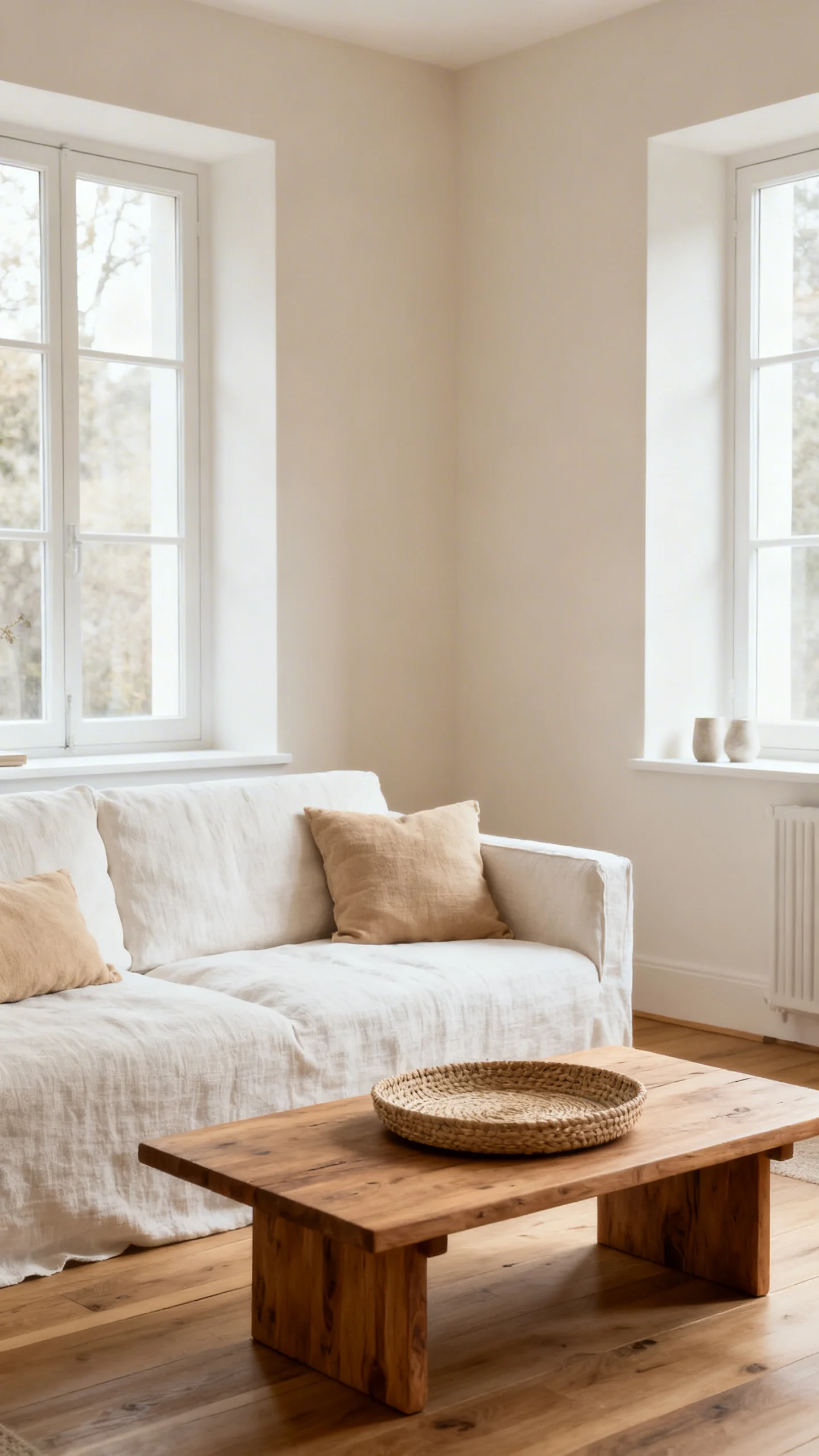
Picture a living room that feels like a deep exhale: warm white walls, a slipcovered sofa in oat linen, and floaty curtains that glow in afternoon light. The palette stays soft—sand, cream, and a whisper of camel—so the room reads bright but never stark.
Finish the mood with a pale oak coffee table, a chunky knit throw, and a woven jute rug that adds that “barefoot, weekend” texture. A single oversized abstract in beige-on-ivory keeps it gallery-clean without breaking the calm.
Idea 2: Modern Greige Minimalism with Matte Black Accents
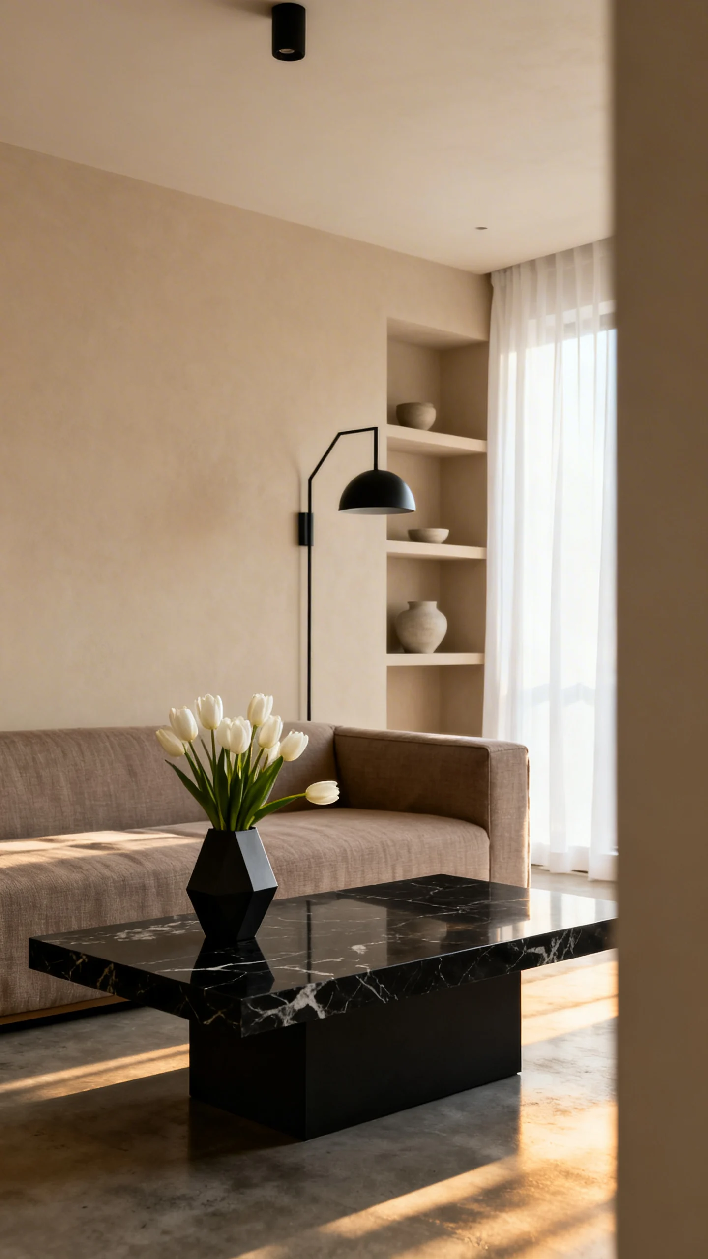
This apartment look is crisp, edited, and architectural: smooth greige walls, a low-profile sofa in stone, and clean-lined storage that disappears into the background. The neutrals here feel cool and modern—think concrete, fog, and soft graphite.
Matte black punctuates the palette like punctuation marks: a slim floor lamp, framed line art, and a minimal coffee table base. Add one tactile element—like a bouclé pillow or ribbed ceramic vase—to keep the minimalism feeling livable.
Idea 3: Cozy Taupe “Cocoon” Bedroom with Layered Texture
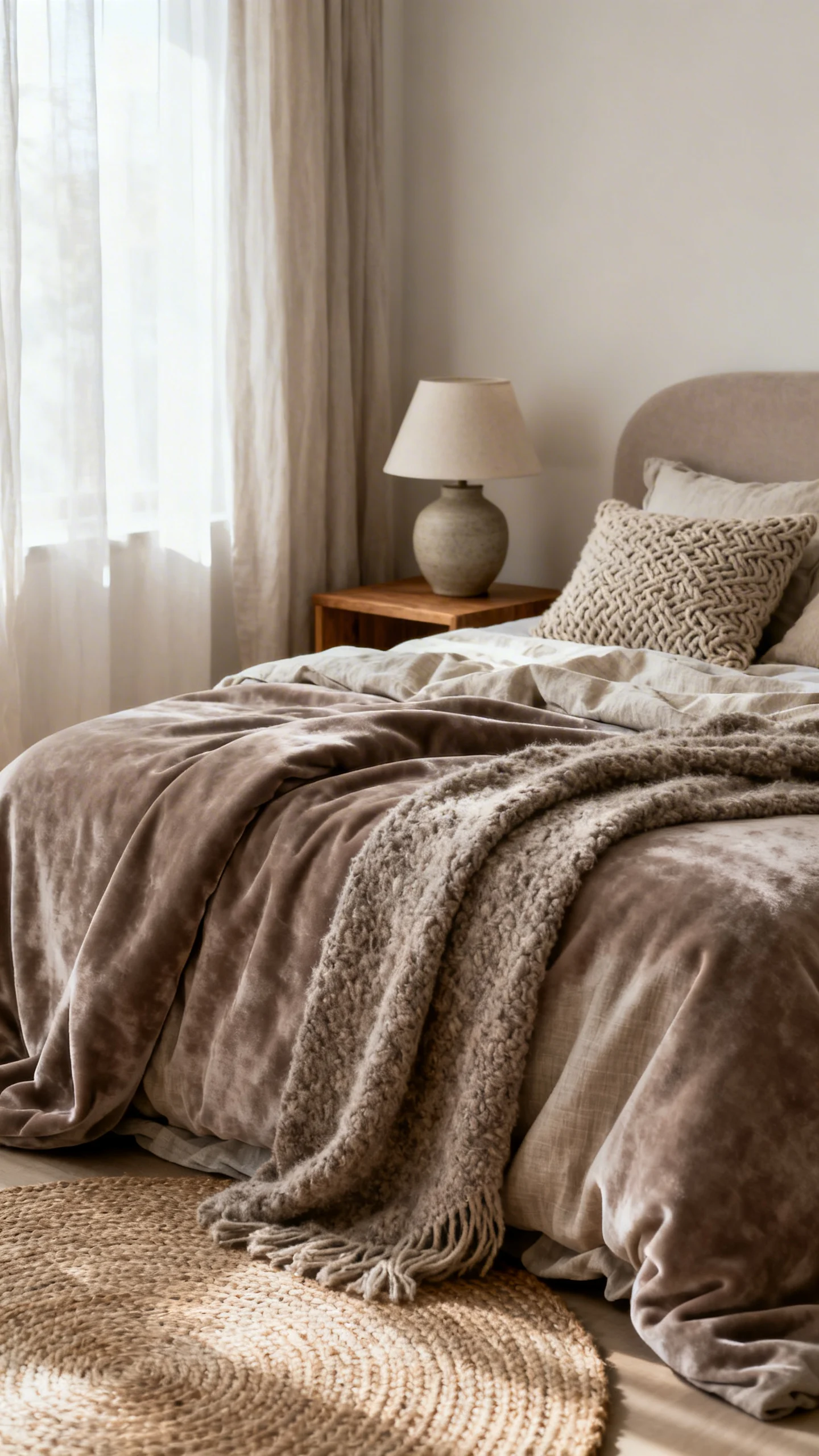
Turn the bedroom into a tonal retreat with walls in mushroom taupe and bedding in layered neutrals: ivory sheets, a biscuit duvet, and a quilted coverlet in soft fawn. Everything is close in value, which creates that enveloping, boutique-hotel hush.
Bring in texture instead of contrast: a channel-tufted headboard, a plush wool rug, and brushed brass bedside lamps that glow warm against the taupe. The vibe is candlelit, soft-focus, and deeply cozy—even in a small footprint.
Idea 4: Scandinavian-Inspired Dining Nook in Birch + Bone
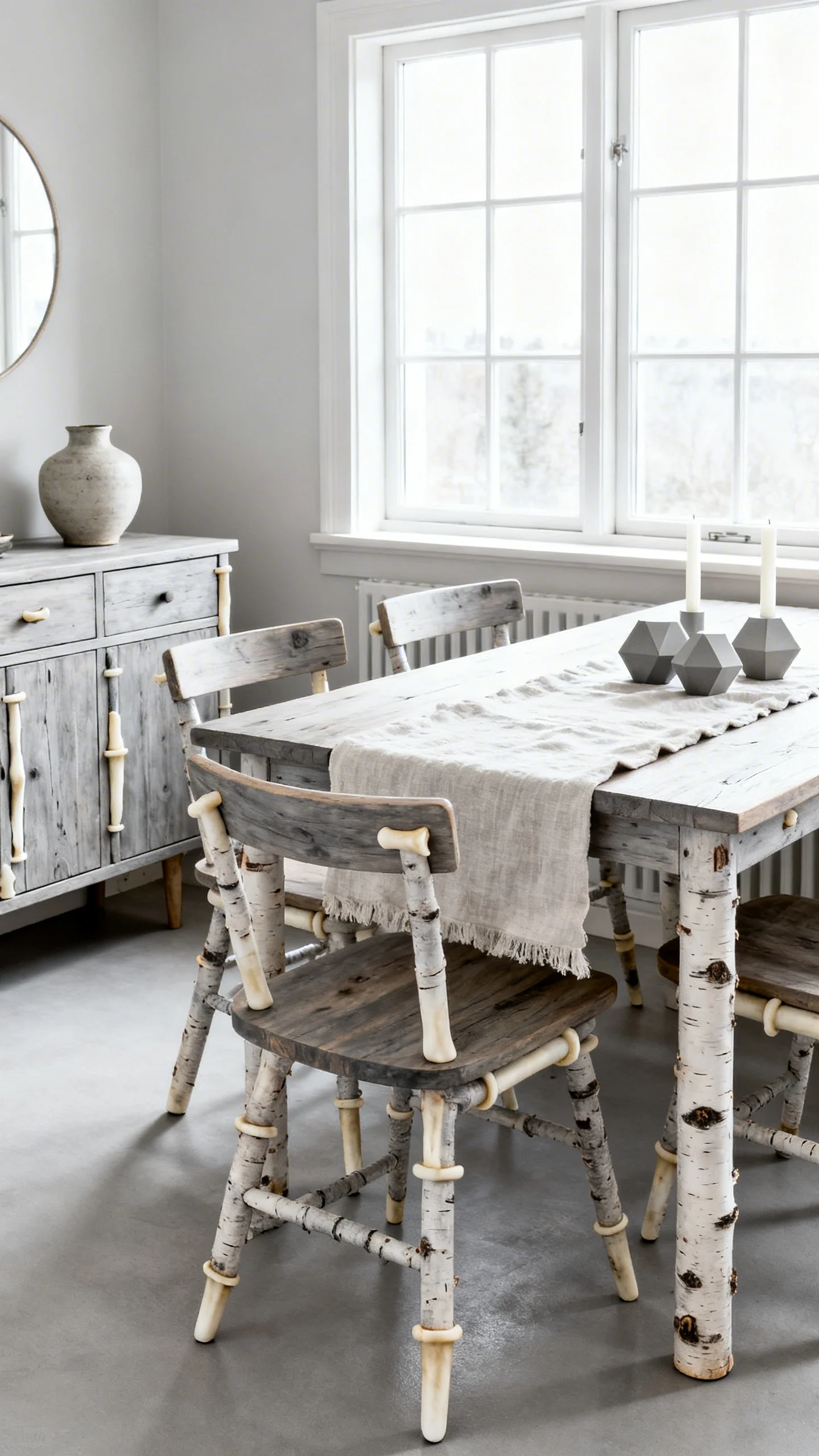
Imagine a sunny corner with a petite birch table, wishbone-style chairs in paper cord, and walls painted a clean bone shade. It’s simple, bright, and quietly design-forward—perfect for apartments where every square foot needs to feel intentional.
Style it like a still life: a clear glass vase with branches, a linen runner in natural flax, and a sculptural pendant in white or pale wood. The neutral palette keeps the nook feeling airy, like it’s always morning.
Idea 5: Earthy Boho Neutrals with Clay, Camel, and Woven Details
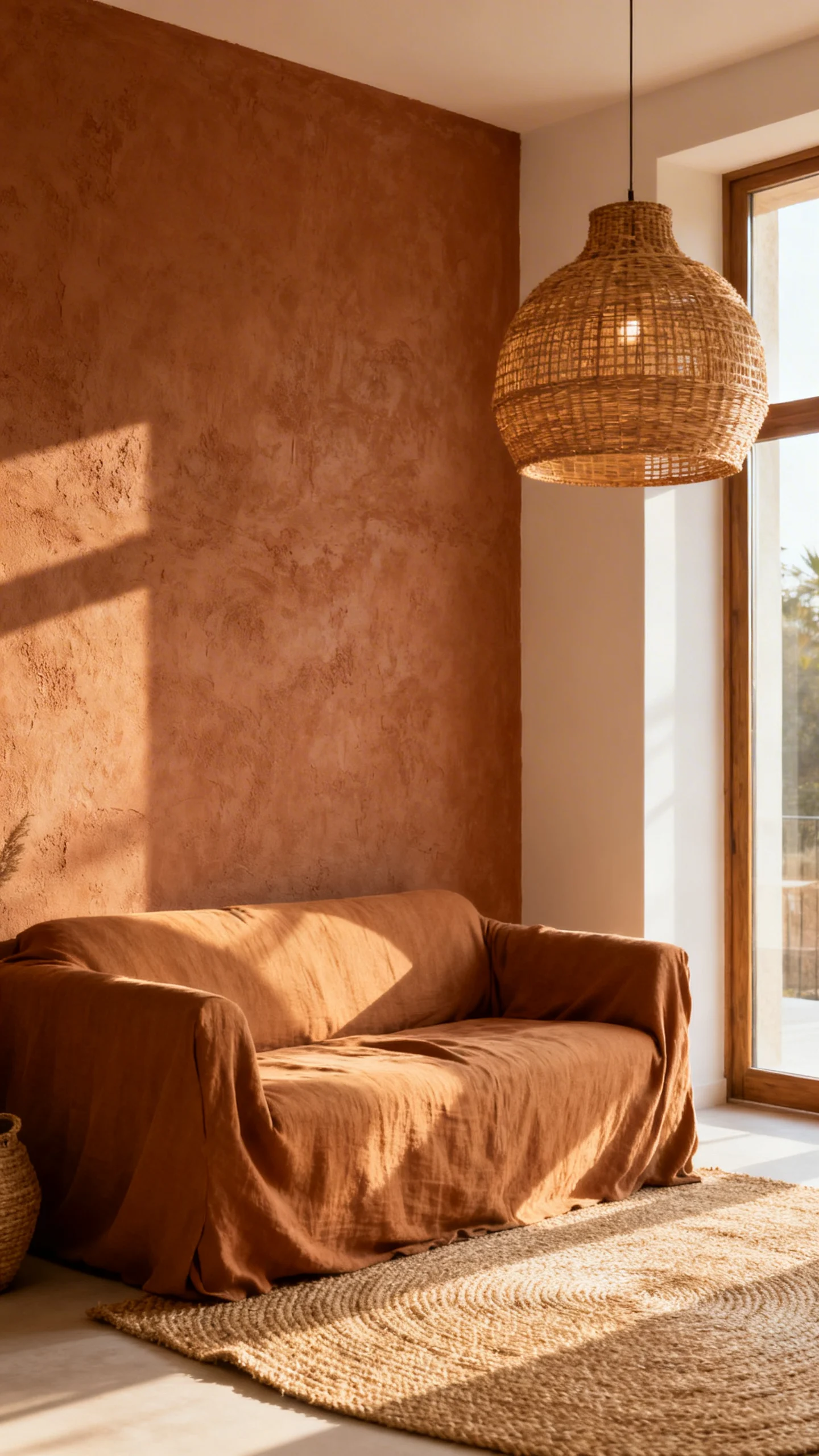
This is neutrals with soul: creamy walls paired with clay-toned textiles, camel leather (or vegan leather) accents, and an eclectic mix of woven baskets and hand-thrown pottery. The palette leans warm, sunbaked, and grounded.
Layer in pattern, but keep it tonal—think a geometric rug in sand and rust-leaning beige, or pillows in subtle stripes. Add a few plants for life and shape; the greens feel especially lush against all that desert-neutral warmth.
Idea 6: Neutral Kitchen Moment in Cream + Soft Oak + Warm Metal
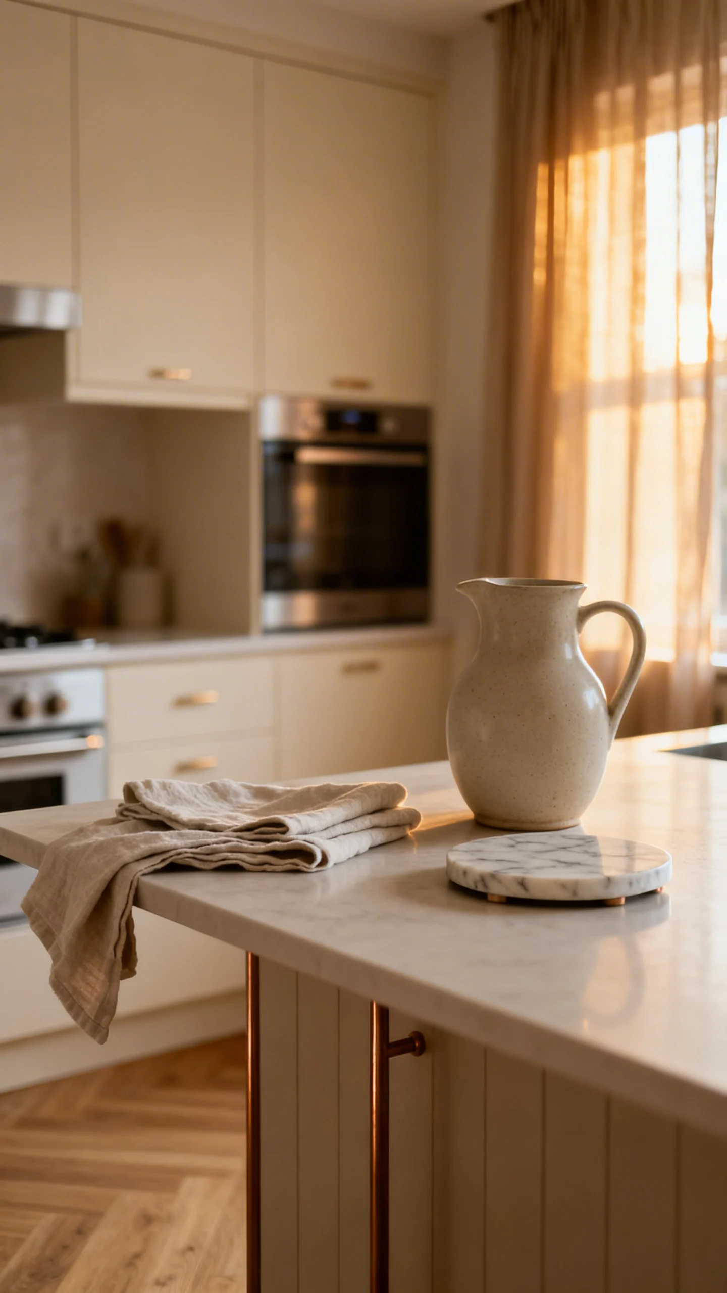
A neutral kitchen can feel like a calming café: creamy cabinetry (or a creamy backsplash moment), soft oak open shelving, and countertops that read like warm stone. Even rentals can channel this vibe through neutral accessories and coordinated tones.
Bring the shine in gently—brushed brass pulls, a warm-metal faucet, or simple pendants with an aged finish. Finish with everyday styling that looks intentional: a wooden cutting board, neutral dish towels, and ceramics in ivory and sand.
Idea 7: High-Contrast Neutrals: Ivory + Charcoal + Natural Wood
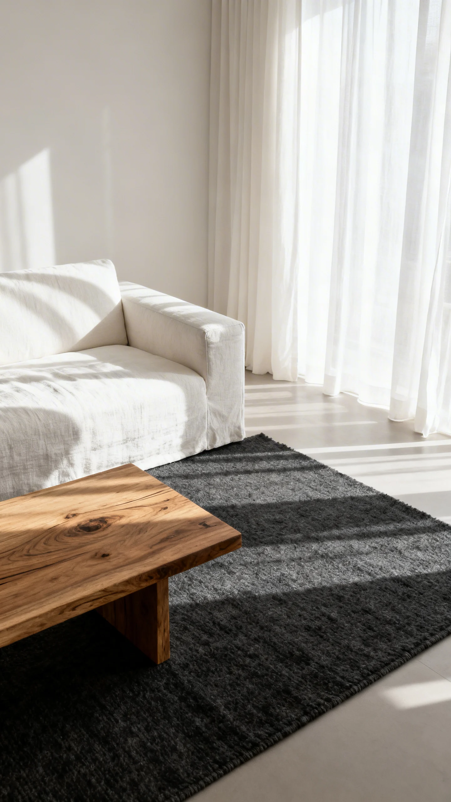
For anyone who loves neutrals but craves definition, this palette is the sweet spot: ivory walls, a charcoal sofa or accent chair, and medium-tone walnut wood that adds depth. The overall look is tailored and modern, like a great coat.
Keep the styling graphic: black-and-white photography, a charcoal rug with a subtle texture, and clean silhouettes. The neutrals still feel soft, but the darker anchor pieces give the room that magazine-level polish.
Idea 8: Neutral Entryway Glow-Up with Beige, Brass, and Mirrors
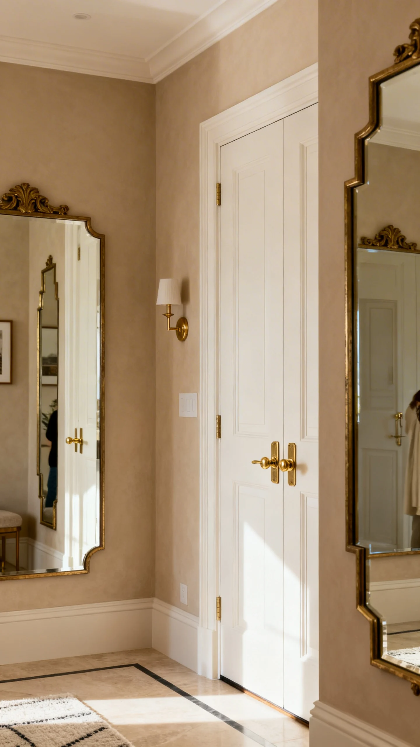
Even a tiny apartment entry can look styled and serene with a beige-on-beige palette. Think warm ivory walls, a slim console in light wood, and a soft runner rug in sand tones that makes the space feel instantly welcoming.
A mirror is the hero here—arched, oversized, or vintage-inspired—to bounce light and widen the view. Add a small brass tray for keys, a ceramic catchall in cream, and one sculptural vase for that “I live beautifully” moment.
Idea 9: Neutral Bathroom Spa in Stone, Pebble, and Soft White
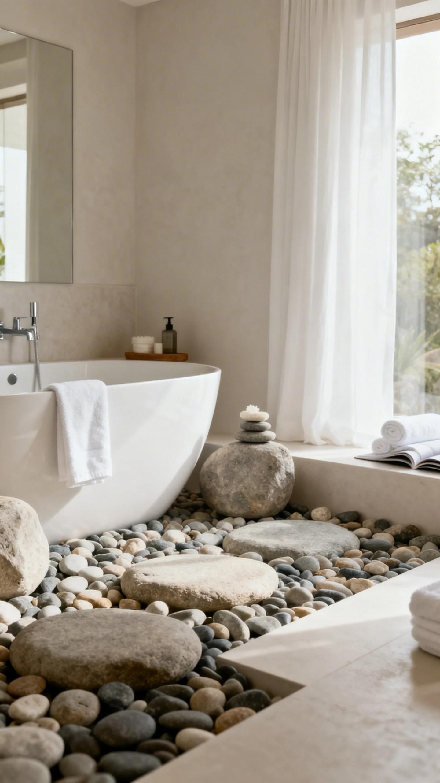
Channel spa calm with soft white walls, stone-inspired details, and accessories in pale gray-beige. The palette should feel like river pebbles and warm steam—clean, soothing, and quietly luxurious.
Make it tactile: fluffy white towels, a ribbed bath mat in oatmeal, and a travertine-style tray for soap and skincare. A frameless mirror or a thin metal frame in brushed nickel keeps the look fresh and modern.
Idea 10: Tonal Neutral Gallery Wall in Cream Frames + Soft Abstracts
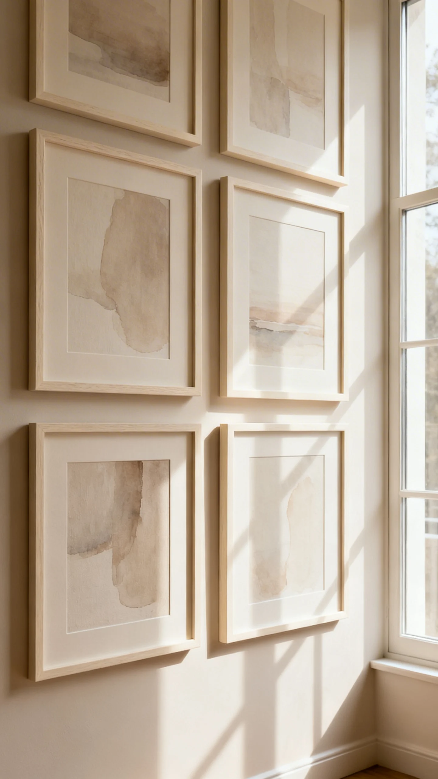
This look is for art lovers who still want calm: a gallery wall built entirely from neutrals. Think cream and light oak frames, soft abstracts in beige washes, and line drawings on ivory paper—layered, but whisper-quiet.
Let the wall feel curated, not loud: mix frame sizes, keep the spacing tidy, and repeat tones so it reads cohesive. Against a warm white or greige wall, the effect is elevated and serene—like a boutique hotel corridor, but personal.
FAQ
What are the most popular neutral paint colors for apartments?
Warm whites, soft greiges, and gentle taupes are the favorites because they flatter most lighting and make spaces feel open. Look for shades that read creamy rather than icy, especially in apartments with limited natural light.
How do I keep a neutral apartment from feeling boring?
Go big on texture and shape: linen, bouclé, wool, rattan, matte ceramics, and warm woods. In a neutral palette, the “interest” comes from materials, layering, and silhouettes—not loud color.
Do neutral palettes work in small apartments?
Yes—neutrals are especially flattering in small spaces because they create visual continuity. When walls, textiles, and large furniture stay in the same family of tones, rooms tend to feel larger and calmer.
Can I mix warm and cool neutrals in one apartment?
You can, and it often looks very designer when it’s balanced. Pair warm neutrals (cream, camel, sand) with cooler ones (stone, greige, charcoal) and connect them through a repeating material like wood, black metal, or brushed brass.
What’s an easy way to test a neutral palette without fully repainting?
Build the palette through textiles and decor first: a neutral rug, curtains, bedding, and a few large accessories in the same tonal family. If it feels right, paint becomes the final layer that makes everything look intentional.