
You know that feeling when a room looks “fine” but doesn’t make your heart do a happy dance? That’s your cue to color drench. It’s the design move where you paint walls, trim, doors—sometimes even the ceiling—in one rich, saturated hue. Result: instant boutique hotel vibes without the boutique price.
If you’ve ever wanted your bedroom to feel cocoon-y, dramatic, and ridiculously pulled together, this guide’s your new BFF. Let’s drench.
1. Pick Your Power Shade (And Don’t Fear the Dark)
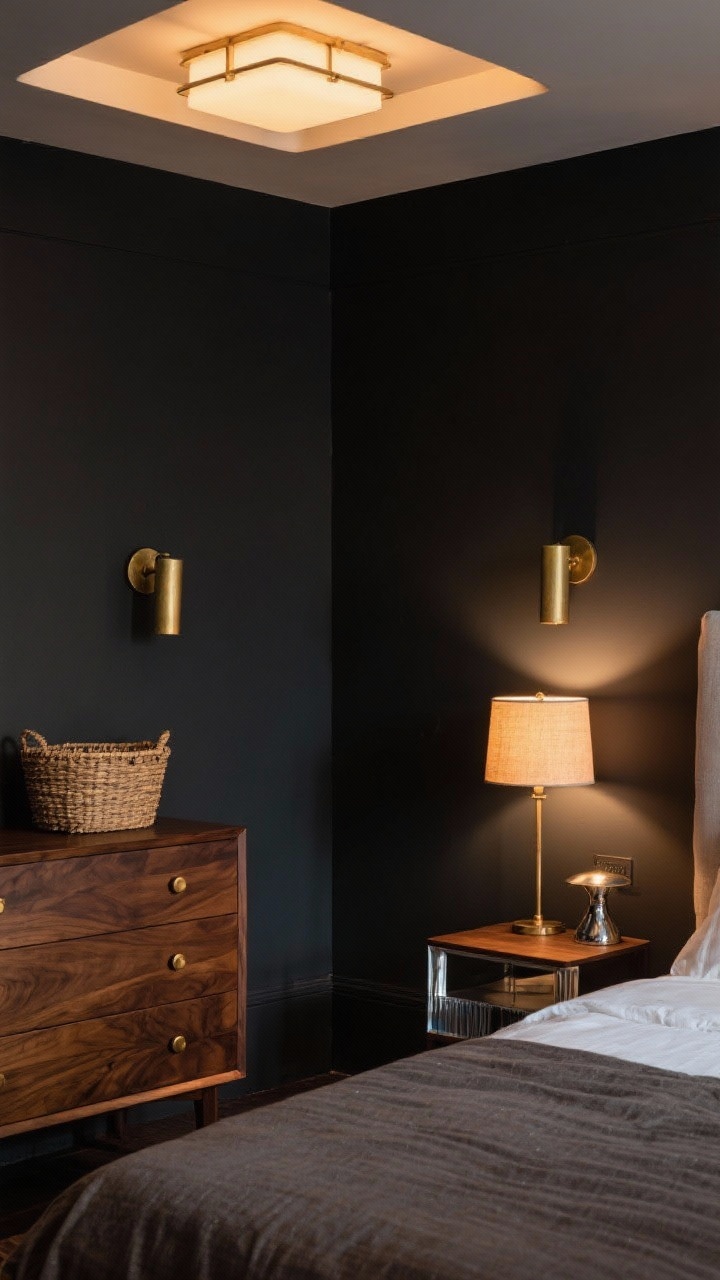
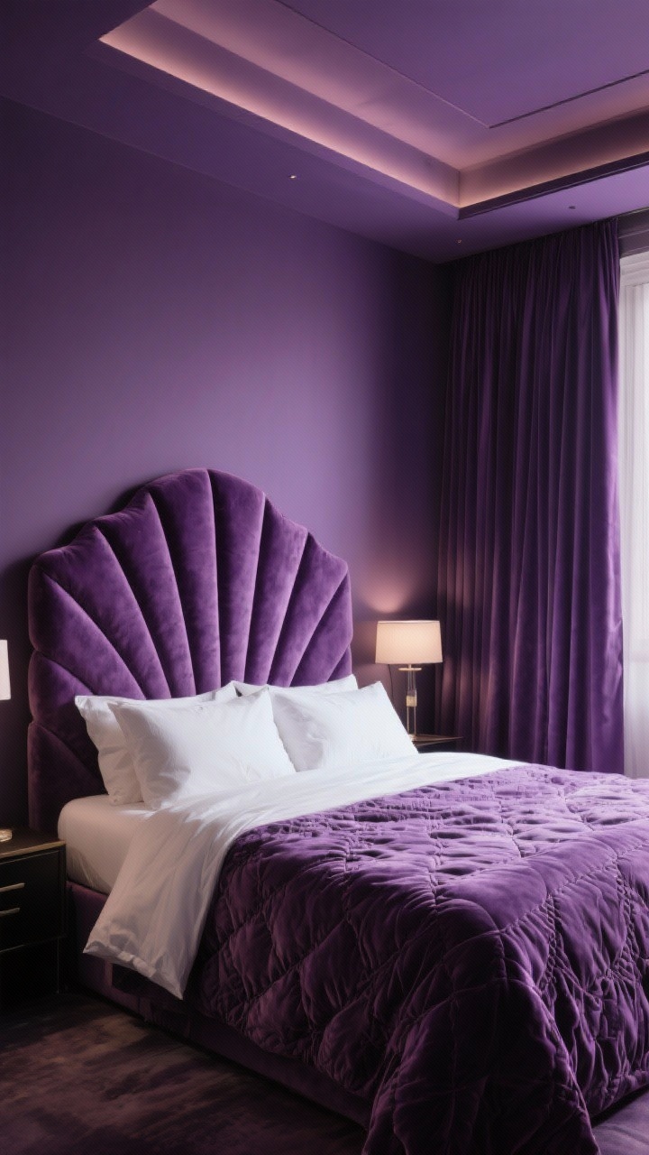
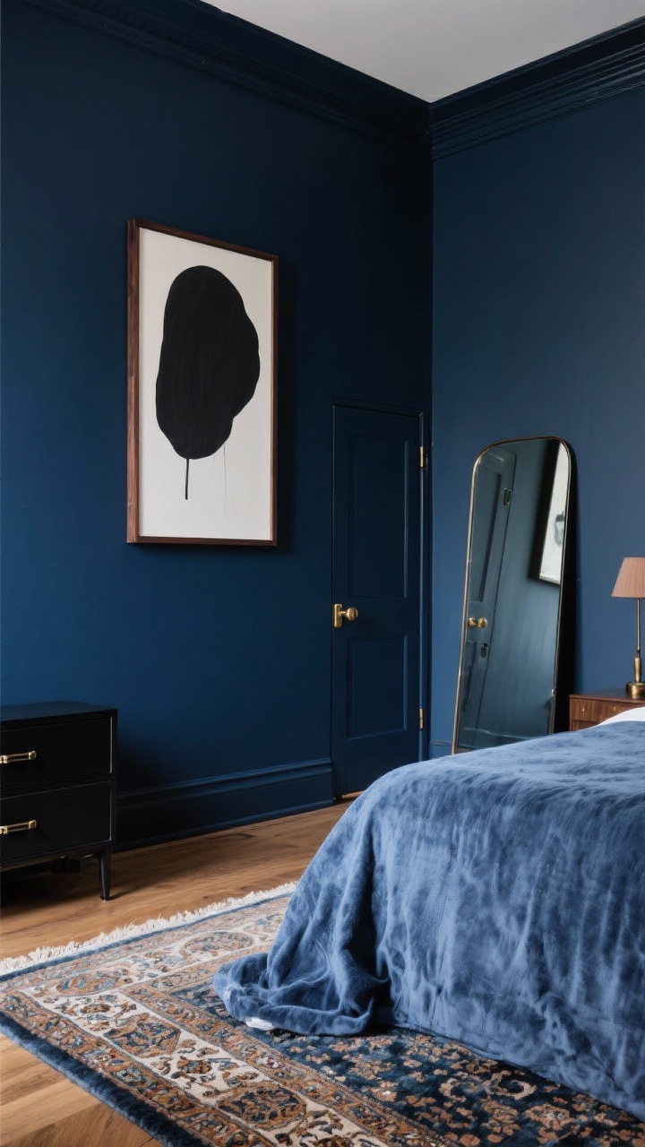
Color drenching loves a shade with confidence. Think inky blues, forest greens, aubergine, oxblood, terracotta, charcoal. Darker tones make the room feel like a luxurious envelope—hello, cozy retreat.
How to choose without panic
- Match the mood: Want calm? Go deep blue or moss. Want drama? Try merlot, plum, or coal.
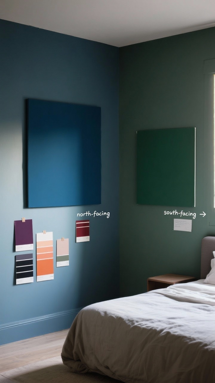
- Check daylight: North-facing rooms love warm hues (rust, ochre). South-facing? Cool tones sing (peacock, slate).
- Sample big: Paint two 2×2 ft swatches on different walls and look at them morning, noon, and night.
FYI: Dark colors don’t automatically make a room smaller. They blur corners and create depth. It’s magic, not math.
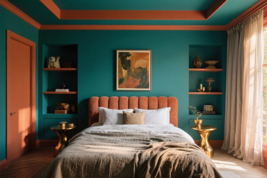
2. Drench It All: Walls, Trim, Doors, And Yup—The Ceiling
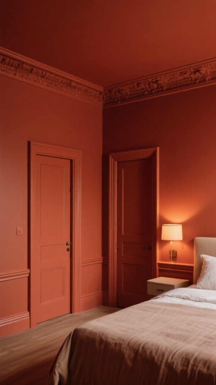
The secret sauce is consistency. Painting walls, baseboards, crown, doors, and the ceiling in the same hue eliminates visual breaks. That’s what creates the luxe, cocooned vibe.
Finish line matters
- Walls: Matte or eggshell for a sophisticated, velvety look.
- Trim/Doors: Satin or semi-gloss in the same color for subtle contrast and durability.
- Ceiling: Same color in matte to avoid glare and keep it cozy.
Want a whisper of dimension? Keep the same color but shift finishes—matte walls, satin trim. It’s low-effort, high-impact.
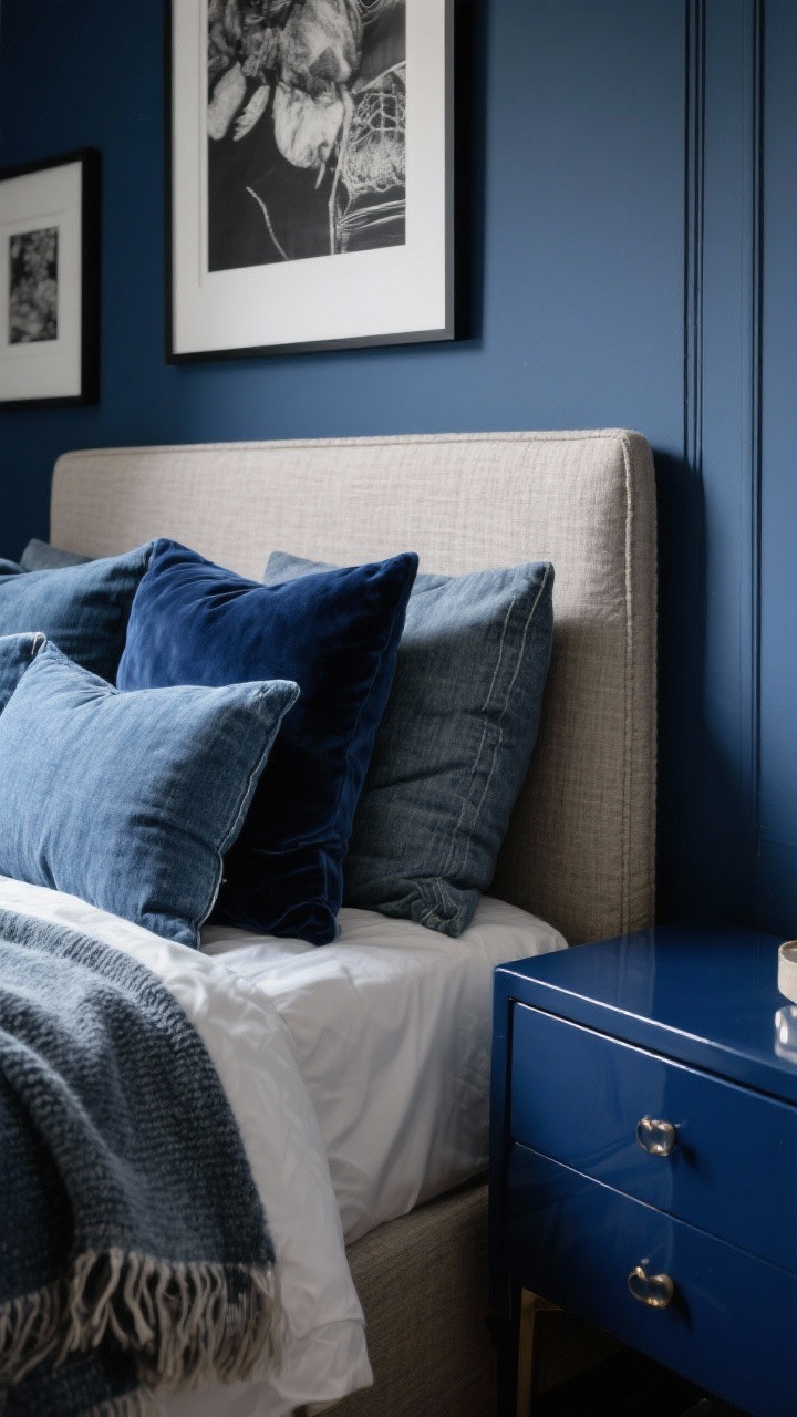
3. Create Depth With Tone-On-Tone Layers
Once you’ve drenched, bring it to life with tone-on-tone pieces. You’re building a gradient, not a rainbow.
Layer like a stylist
- Textiles: If your walls are midnight blue, mix denim, navy velvet, and slate linen on the bed.
- Furniture: Lacquered nightstands in a slightly lighter or darker shade = chef’s kiss.
- Art & lamps: Go monochrome mats or frames that echo the wall color for that gallery feel.
Pro tip: Add one contrast texture—like a natural linen headboard or nubby wool throw—so it doesn’t feel flat.
4. Balance With Warmth: Wood, Metals, And Glow
Bold paint is the star, but supporting actors matter. Bring in warm, tactile elements so the room feels inviting, not cave-y.
Mix your materials
- Wood: Walnut, white oak, or even rattan smooth out saturated hues and add earthiness.
- Metals: Brass or aged gold fixtures pop against deep colors; chrome reads crisp with cool tones.
- Lighting: Layer ambient (ceiling), task (sconces), and glow (table lamps). Use warm 2700–3000K bulbs.
IMO, a dim-to-warm smart bulb is the unsung hero of the color-drenched bedroom. Cozy on tap.
5. Choose Your Statement: Headboard, Bedding, Or Curtains
With everything drenched, choose one element to shine. Not everything needs jazz hands—just one star piece.
Three winning approaches
- The Sculptural Headboard: Channel tufted velvet or a curvy wood profile set against saturated walls? Yes please.
- The Luxe Bedding Moment: Go heavy on texture (matelassé, quilted velvet, washed linen). Keep colors tonal.
- The Floor-To-Ceiling Curtains: Same color family, generous fullness, mounted high and wide. Instant hotel energy.
Want a little contrast? Let white bedding be your palette cleanser. Crisp, calming, and easy to maintain.
6. Accessorize Smart: Art, Rugs, And Hardware That Hit Different
Accessories are how you steer the vibe: moody, modern, or romantic. Keep it curated, not cluttered.
What to add (and why)
- Art: Oversized pieces with negative space or monochrome photography keep it sophisticated. Float frames or dark wood frames blend beautifully.
- Rugs: Anchor the room with a plush rug in a neighboring tone (e.g., smoky blue with navy walls) or a vintage Persian for richness.
- Hardware: Swap to brass or blackened bronze pulls and door hardware for cohesion.
- Mirrors: A large mirror bounces light and relieves saturation without breaking the mood.
Editing tip: If you bring in pattern, keep it large-scale. Tiny patterns get fussy against big, bold color.
7. Execute Like A Pro: Prep, Paint, And Maintenance
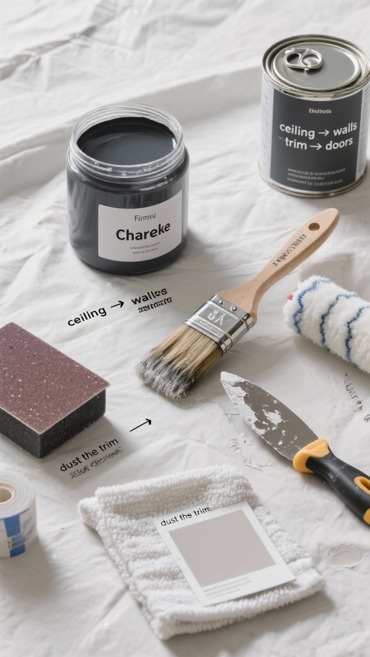
Great paint jobs are 80% prep. The color is only as flawless as the surface underneath—sorry, but it’s true.
Prep checklist
- Patch and sand: Fill nail holes and sand to baby-smooth. Bold colors highlight imperfections.
- Prime smart: Use a tinted primer close to your final shade for deeper, truer color.
- Cut clean lines: Quality angled brush for edges; don’t rush your cutting in.
Painting tips
- Order: Ceiling → walls → trim → doors. Keeps splatters logical.
- Coats: Expect 2–3 thin coats. Thick coats drip and flash.
- Finish consistency: Keep the same color code across finishes; sheen will create subtle contrast.
Care and touch-ups
- Keep a labeled jar of your color for quick fixes.
- Dust the trim regularly; darker colors show dust faster.
- Sun check: If you get strong light, consider UV-filtering shades to prevent fade.
FYI: If you’re renting or commitment-shy, try temporary color drenching with peel-and-stick panels on the headboard wall and color-matched curtains and bedding. Same vibe, easier exit.
Quick Color Pairing Ideas
- Deep Teal + Brass + Walnut + Ivory Linen
- Olive Green + Blackened Bronze + Natural Oak + Ecru
- Aubergine + Antique Gold + Smoked Wood + Bone
- Charcoal + Chrome + Black Stain + Crisp White
- Terracotta + Aged Brass + Cane + Cream
Ready to drench? Pick the shade that makes you grin, commit to painting it all, and let texture and lighting do the rest. Your bedroom’s about to go from “fine” to “whoa, did you hire a designer?”—and you did. It’s you.