
You know that feeling when you walk into a bedroom and instantly breathe easier? That’s color magic. The right combos don’t just look pretty—they change the vibe, help you unwind, and make your space feel like a hug. Let’s talk seven foolproof color pairings that deliver maximum calm with zero snooze-factor. Ready to build your dream retreat?
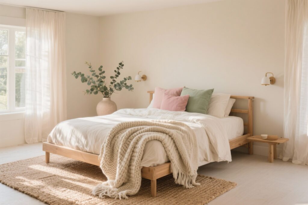
1. Soft Sage + Warm Linen: The Spa-At-Home Combo
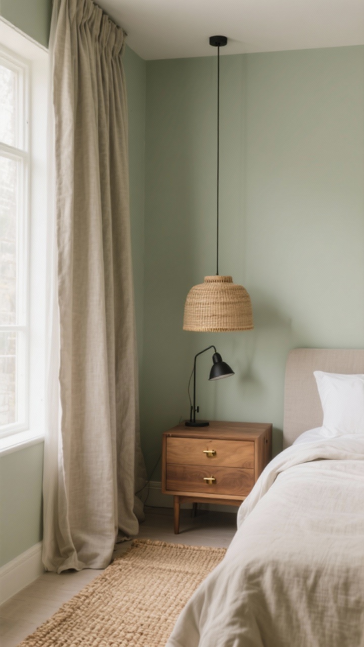
Why it works: Soft sage brings that quiet, nature-adjacent calm, while warm linen (think creamy beige) keeps things cozy and grounded. It’s like a morning walk in a botanical garden, minus the pollen.
Use sage on the walls for a gentle backdrop and layer in linen-hued bedding and curtains. The palette is muted but never boring—great for tiny rooms or spaces with a lot of natural light.
Make It Happen
- Choose matte sage paint for a velvety look; avoid high-gloss to keep the vibe soft.
- Mix in natural textures like rattan, oak, and woven jute to warm it up.
- Accent with brushed brass or matte black hardware for contrast.
2. Greige + Dusty Blue: The Quiet-Lux Pair
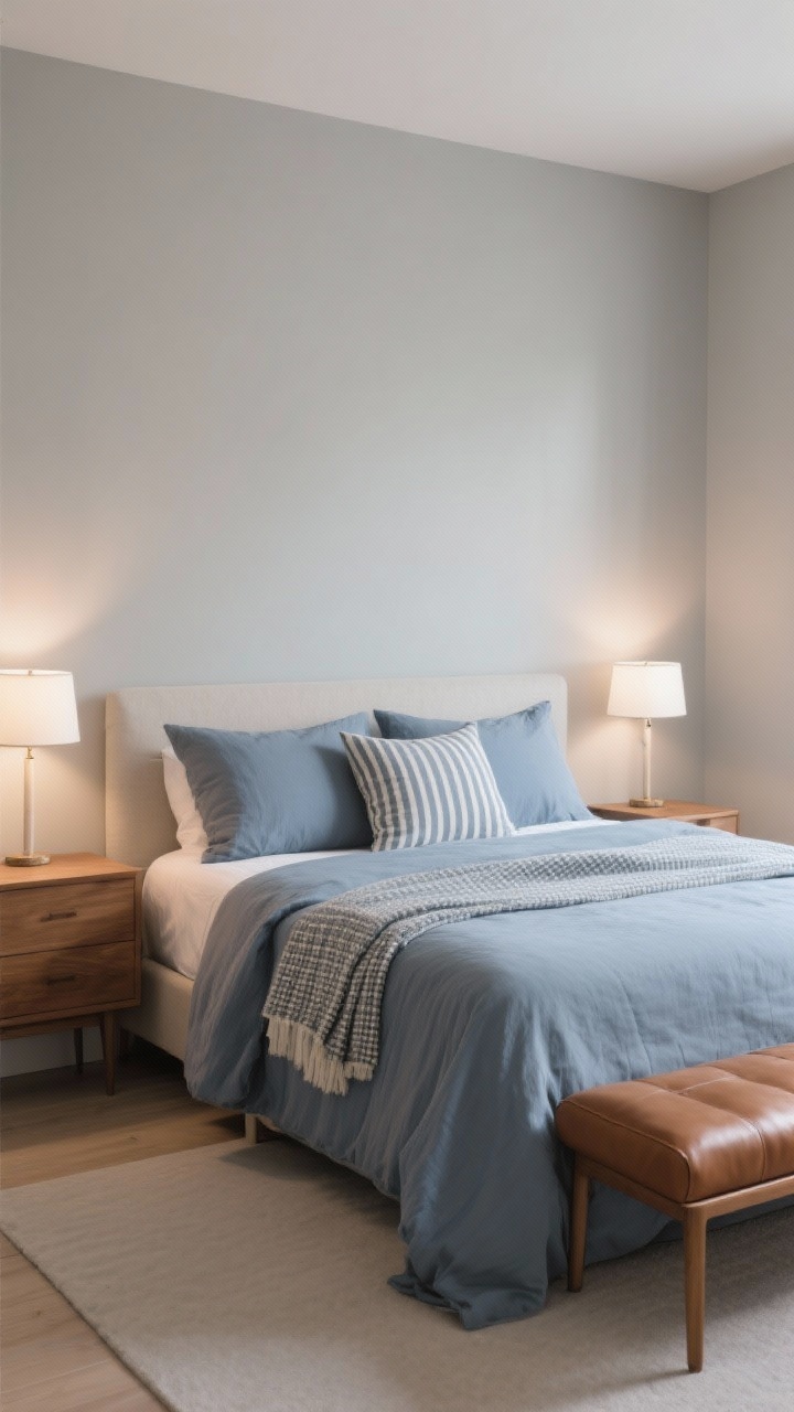
Why it works: Greige (gray + beige) is the chill neutral everyone gets along with. Add dusty blue, and you’ve got a serene, cloudlike palette that whispers “go to bed earlier.”
Try greige walls with a dusty blue duvet and pillow shams. If you’re nervous about blue feeling cold, choose versions with a touch of gray—no baby nursery vibes here.
Make It Happen
- Keep patterns subtle: thin stripes, micro-checks, or tone-on-tone florals.
- Layer warm wood nightstands or a caramel leather bench to balance the cool blue.
- Pick soft white bulbs (2700K–3000K) to keep everything cozy at night.
3. Mocha Taupe + Cream + Charcoal: The Elevated Neutral Trio
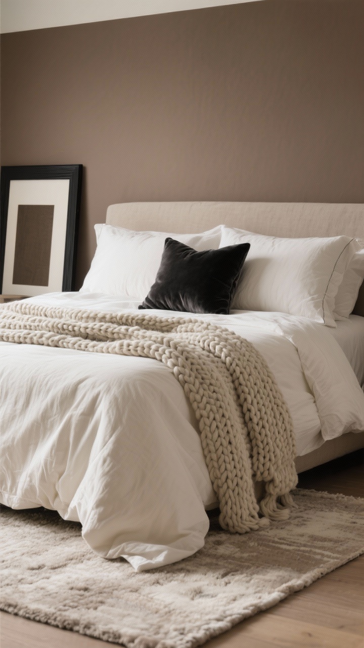
Why it works: This combo is calm without being flat. Mocha taupe reads soothing, cream keeps it airy, and charcoal adds depth so your room doesn’t feel like a bowl of oatmeal.
Go mocha on the walls, cream bedding, and charcoal accents like a throw, rug border, or picture frames. It’s hotel-level chic you can actually live with.
Make It Happen
- Use texture contrast: chunky knit throw, linen duvet, velvet pillows.
- Choose a low-contrast rug (cream with light taupe) for a seamless, calm foundation.
- FYI: Add a single soft green plant to break up all the neutrals.
4. Blush Nude + Mushroom + Warm White: The Cozy, Grown-Up Pink
Why it works: Blush nude brings a gentle warmth without screaming “pink.” Pair with mushroom (that gray-brown neutral everyone’s suddenly obsessed with) and warm white for a layered, soothing palette that flatters any light.
Paint walls in warm white and bring in blush textiles—pillow covers, a quilt, maybe curtains if you’re feeling bold. Anchor with mushroom furniture or an upholstered headboard.
Make It Happen
- Stick to muted blush, not bubblegum—look for words like “nude,” “dusty,” or “rose.”
- Swap silver hardware for antique brass or champagne for cohesive warmth.
- Keep art simple: soft landscapes, line drawings, or sepia photography.
5. Deep Navy + Oat + Soft Sky: Moody Meets Airy
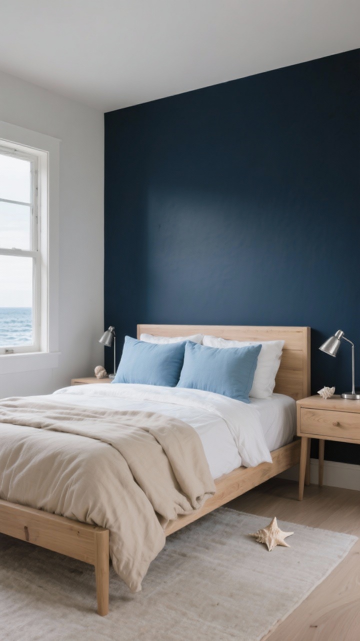
Why it works: Dark colors can be incredibly calming when balanced with light, buttery neutrals. Deep navy wraps the space, oat keeps it cozy, and a hint of soft sky blue lightens the mood—no cave energy here.
Use navy on an accent wall or headboard alcove, then layer oat-colored bedding and soft sky pillows. The mix feels serene with a subtle coastal nod, minus the seashells.
Make It Happen
- Choose eggshell or matte for navy to hide imperfections and reduce glare.
- Bring in light woods (oak, ash) to prevent the palette from feeling heavy.
- Keep metal accents cool (brushed nickel) for a crisp finish, IMO.
6. Clay Terracotta + Sand + Olive: Nature-Inspired and Grounding
Why it works: Earth tones are inherently calming because our brains love nature. Clay terracotta brings warmth, sand keeps it breezy, and olive adds that comforting, organic note.
Try sand walls, a terracotta quilt or lumbar pillow, and olive curtains or a bench cushion. It’s cozy without feeling trendy-for-five-minutes.
Make It Happen
- Stick to matte finishes so these earthy hues feel sunbaked and soft.
- Layer linen and cotton textiles for breathable comfort—great for year-round use.
- Add black accents (frame, lamp base) to sharpen the look just a touch.
7. Misty Lavender + Pebble Gray + Ivory: Soft and Restful With a Twist
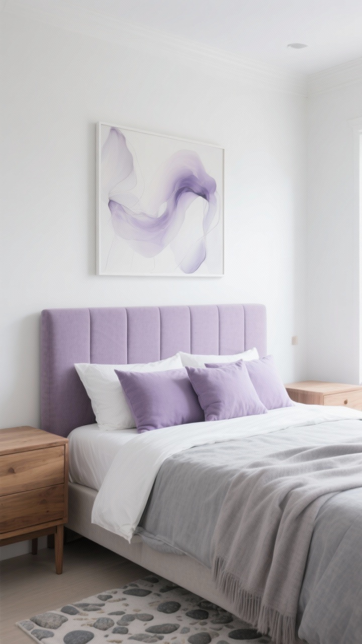
Why it works: Lavender in its misty, gray-tinted form is surprisingly calming—not sweet, just serene. Pair with pebble gray and ivory, and you’ll get a breezy, light-filled feel that still reads sophisticated.
Use ivory on walls for brightness, bring in pebble gray textiles, and sprinkle misty lavender through pillows or a throw. If you love the idea, go bolder with a lavender upholstered headboard—dreamy, right?
Make It Happen
- Choose cool-toned bulbs sparingly; warm white lighting keeps lavender from skewing icy.
- Keep patterns ethereal: watercolor prints, soft botanicals, or airy abstracts.
- Balance with warm wood tones to avoid a too-cool palette.
Pro Tips For Picking Your Calm-Cozy Palette
- Test in real light: Sample paint on poster boards and move them around. Morning light vs. lamp light can change everything. FYI: north-facing rooms trend cooler.
- Mind the finishes: Matte/eggshell walls = soft and restful. Satin looks shinier (read: less cozy).
- Repeat colors 3 times: Use each color in at least three places (wall, pillow, lamp) to feel intentional.
- Texture = instant warmth: Bouclé, linen, knit, and velvet tame cooler hues and make neutrals feel luxe.
- Edit your palette: Two to three main colors + one metal finish is a sweet spot for serenity.
What To Avoid (So You Actually Sleep)
- High-contrast everything: Black-and-white can look sharp, but it’s energizing—save it for the office.
- Overly saturated brights: Neon or primary colors can be stimulating. Keep bold accents minimal.
- Too many patterns: Mix scales carefully or you’ll create visual noise. Calm doesn’t shout.
At the end of the day, your bedroom should feel like a deep exhale. Pick the color combo that makes your shoulders drop an inch, layer in textures, and keep the lighting warm. You’ve got this—now go make that calm and cozy escape you’ll never want to leave.