
You’ve got shelves. You’ve got stuff. Now let’s make them look like a Pinterest board come to life without buying 47 new candles. These smart styling tricks work whether you’re into minimal, cozy, or that perfectly curated “I travel a lot and read things” vibe. Ready to level up your shelves?
1. Edit Ruthlessly, Then Add Back With Intention
Before we style, we purge. Take everything off your shelves and only put back what you love or use. If it doesn’t spark joy, spark conversation, or store something useful—bye.
Pro Moves
- Start with anchors: Place 1–3 larger pieces per shelf first (think a chunky vase, a stacked box, or a bold art frame).
- Use the “60/30/10” rule: 60% functional (books, boxes), 30% sculptural (vases, bowls), 10% wildcard (quirky objects, vintage finds).
- Respect negative space: Leave breathing room so each piece can shine. Clutter kills the vibe, FYI.
Minimal doesn’t mean boring—it means intentional. Cozy doesn’t mean messy—it means inviting. Curated doesn’t mean expensive—it means personal.
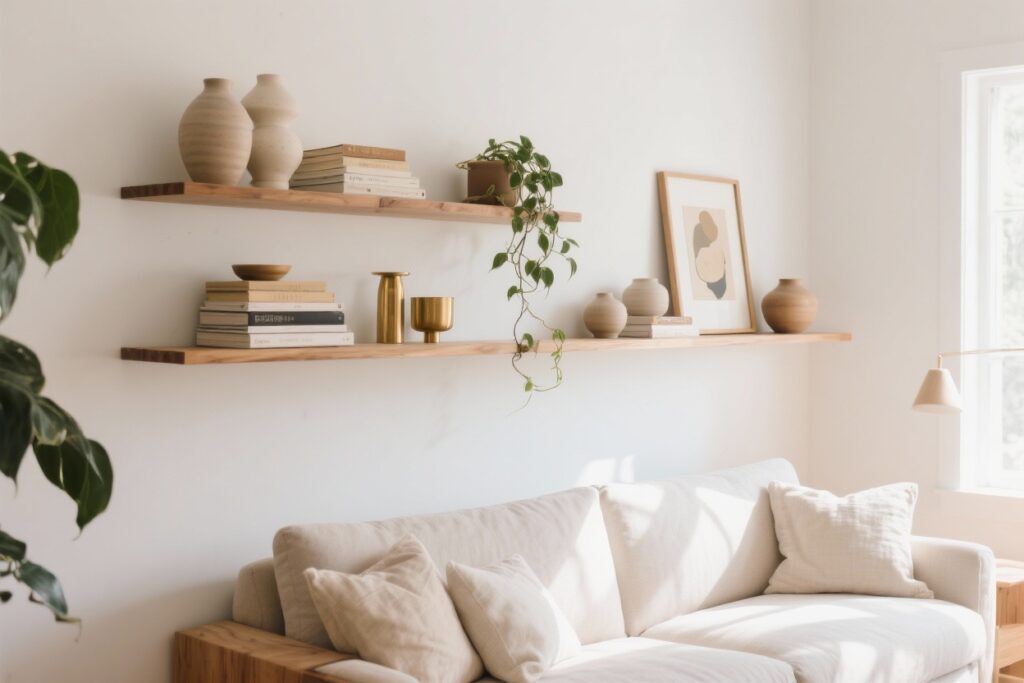
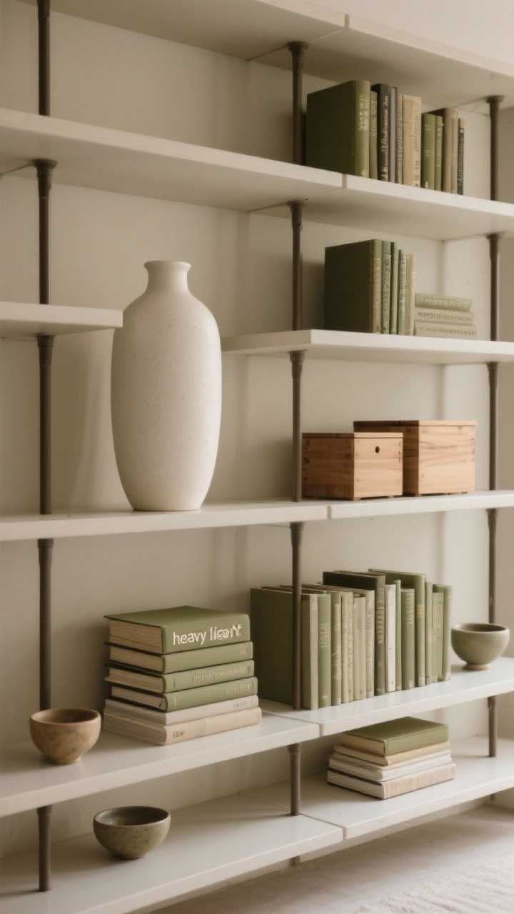
2. Layer Heights, Depths, And Shapes For Visual Rhythm
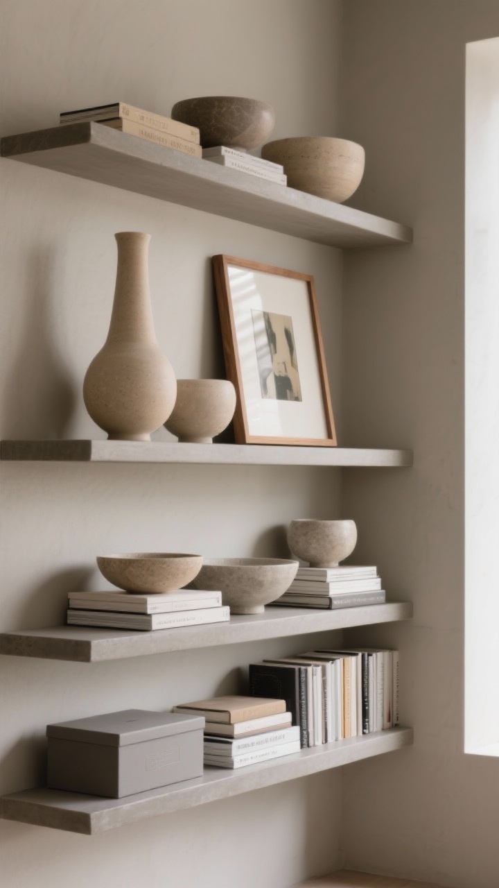
Flat shelves look… flat. Create rhythm by playing with scale and depth. Think tall + medium + low, front + middle + back.
How To Get The Mix Right
- Trios win: Group items in threes with varied heights. A tall vase, a mid-height frame, and a low bowl = chef’s kiss.
- Stack + lean: Stack books horizontally, then lean a small frame or art piece behind to add dimension.
- Echo shapes: Repeat curves (bowls, orbs) or lines (books, boxes) to make it feel cohesive, not chaotic.
IMO, shelves are tiny stages. Give each “actor” a role and a spotlight. No understudies here.
3. Style Books Like Design Elements (Not Just Reading Material)
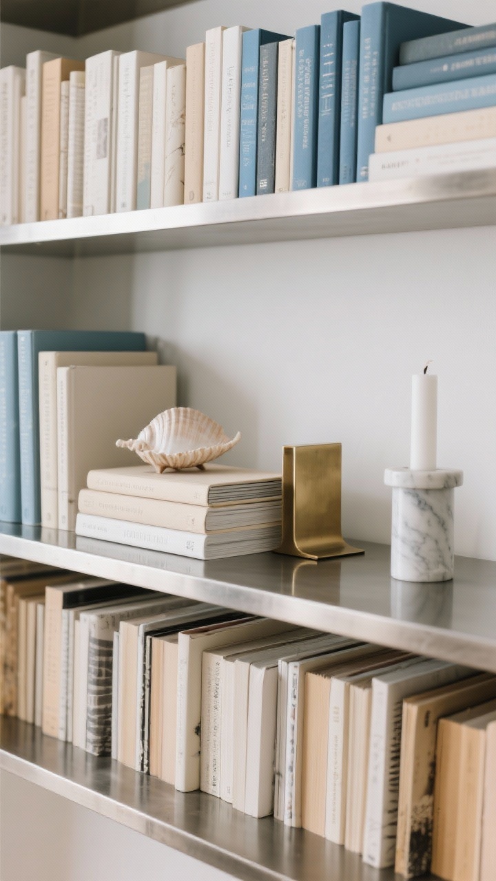
Books are the backbone of a great shelf—use them like decor tools. Mix vertical rows with horizontal stacks to create structure.
Book Styling Tricks
- Spine strategy: Color-code for a clean look, or flip to neutral pages for minimal vibes.
- Elevate small objects: Use a short stack of books as a pedestal for a candle, shell, or small sculpture.
- Integrate bookends: Marble, wood, or metal bookends add polish and keep stacks tidy.
- Go low-key library: Line one entire shelf with books to ground the arrangement, then keep upper shelves lighter.
Bonus: a casually open book on a stand says “I read,” even if you just skim captions. We won’t tell.
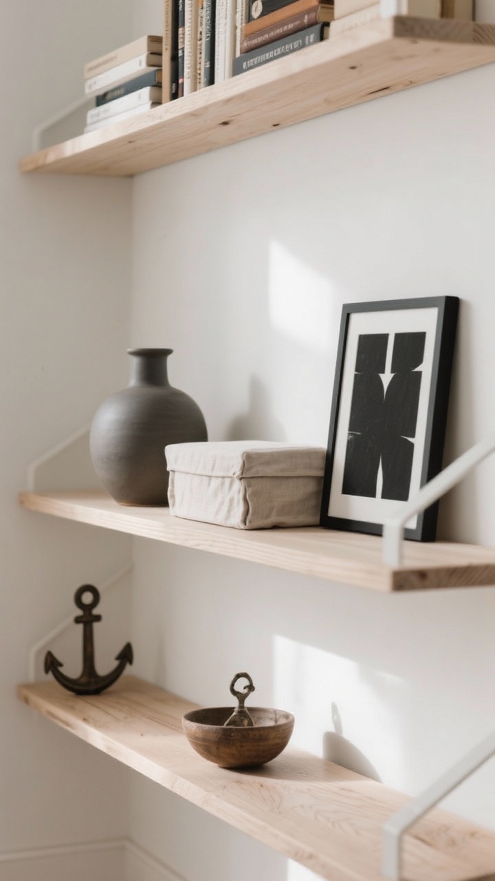
4. Bring In Cozy Texture With Natural Materials
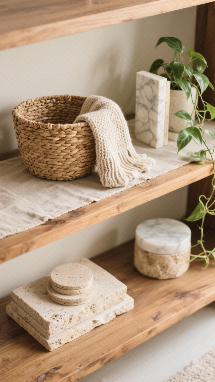
If your shelves feel stiff, add texture. Natural materials soften edges and instantly warm things up.
Texture Toolbox
- Woven baskets: Hide remotes, cords, or random things you don’t want to see. Cozy and practical.
- Raw wood + stone: Cutting boards, travertine coasters, marble bookends—instant richness.
- Soft touch: A folded linen runner under objects or a mini knit throw over a basket adds a tactile layer.
- Greenery: A trailing pothos or dried stems adds life without trying too hard.
Textures keep minimal shelves from feeling sterile and make curated shelves feel lived-in (in a chic way).
5. Create Micro Vignettes With A Story
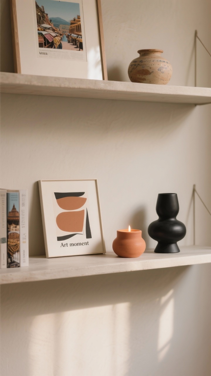
The best shelves tell stories. Group pieces that share a theme, color, or memory to create mini moments on each shelf.
Vignette Recipes
- Travel shelf: A framed postcard, a ceramic from a market, and a book from that trip.
- Art moment: A small leaning print, a sculptural object, and a candle in a complementary color.
- Tea nook: Stacked saucers, a pretty teapot, and a small jar of loose leaf—functional and adorable.
Give each vignette a hero piece and two supporting actors. Keep the palette tight and repeat colors across shelves for flow.
6. Balance Symmetry And Asymmetry Like A Stylist
Perfect symmetry can feel formal; pure asymmetry can feel chaotic. The sweet spot? Balanced asymmetry—visually even, but not matchy-matchy.
Easy Balancing Tricks
- Weight distribution: If you put a tall vase on the left, balance the right with two medium items stacked.
- Odd numbers rule: Groups of 3 or 5 are more dynamic than 2 or 4.
- Row rhythm: Alternate “heavy” and “light” shelves so your eye dances, not trips.
- Color balance: Repeat an accent color in at least three places across the whole unit.
Stand back every few minutes and squint. If one side screams louder than the other, adjust. Highly technical, I know.
7. Add Atmosphere: Lighting, Scent, And Seasonal Switch-Ups
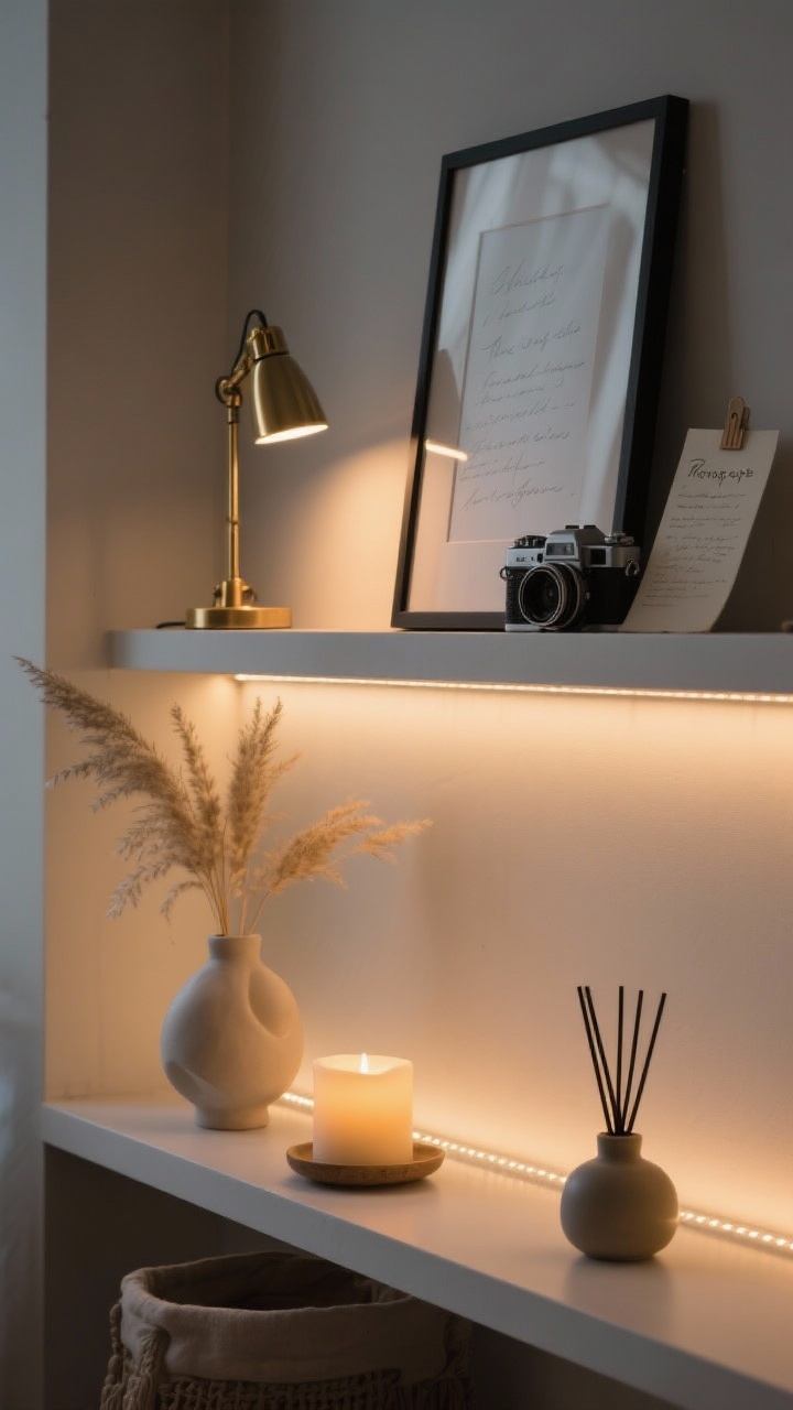
Want your shelves to feel finished? Layer in ambience. Lighting and scent turn good styling into a whole mood.
Atmosphere Upgrades
- Lighting: Clip-on picture lights, LED strip lights, or a small table lamp on a lower shelf add warmth and depth.
- Scent: A candle or diffuser blends form and function—choose vessels that match your palette.
- Seasonal edit: Rotate a few items seasonally—dried grasses in fall, citrus bowls in summer, greenery in winter.
- Personal artifacts: Frame a handwritten recipe, display a vintage camera, or show off a handmade bowl. That’s the curated magic.
FYI, dimmable puck lights under a shelf are a game changer and take two minutes to install. Zero electrician required.
Quick Styling Checklist
- Edit first. Then place anchors.
- Mix heights, depths, and shapes.
- Style books both vertical and horizontal.
- Layer textures: wood, stone, woven, greenery.
- Build story-driven vignettes.
- Balance the overall composition.
- Finish with light, scent, and seasonal touches.
You’ve got this. Start simple, trust your eye, and keep tweaking until it feels right. The best shelves aren’t perfect—they’re personal, cozy, and a little bit you. Now go make those surfaces work for their rent.